This is the full developer documentation for React Native Unistyles 3.0
# Configuration
> How configure Unistyles
To unlock more features and tailor Unistyles to your needs, you can configure it. The Unistyles configuration is divided into three parts:
1. **Themes**
2. **Breakpoints**
3. **Settings**
Note
Each configuration is optional but enables advanced features, which are explained in the guide [How Unistyles Works?](/v3/start/how-unistyles-works)
### Themes (Optional)
[Section titled “Themes (Optional)”](#themes-optional)
`Themes` is a JavaScript object where the keys represent unique theme names, and the values are the corresponding theme definitions. For more details, refer to the [theming](/v3/guides/theming) guide.
unistyles.ts
```tsx
const lightTheme = {
colors: {
primary: '#ff1ff4',
secondary: '#1ff4ff'
// any nesting, spreading, arrays, etc.
},
// functions, external imports, etc.
gap: (v: number) => v * 8
}
const otherTheme = {
colors: {
primary: '#aa12ff',
secondary: 'pink'
},
gap: (v: number) => v * 8
}
const appThemes = {
light: lightTheme,
other: otherTheme
}
```
Note
Unistyles supports any dynamic theme and doesn’t enforce a specific structure. To avoid TypeScript issues, ensure that all themes share the same type.
### Breakpoints (Optional)
[Section titled “Breakpoints (Optional)”](#breakpoints-optional)
`Breakpoints` is a JavaScript object where the keys are unique breakpoint names and the values are the corresponding breakpoint values (numbers). Be sure to register at least one breakpoint with a value of 0, as it’s required to simulate the cascading behavior of CSS media queries.
unistyles.ts
```tsx
const breakpoints = {
xs: 0, // <-- make sure to register one breakpoint with value 0
sm: 300,
md: 500,
lg: 800,
xl: 1200
// use as many breakpoints as you need
}
```
### Settings (Optional)
[Section titled “Settings (Optional)”](#settings-optional)
The `Settings` object has been simplified, and in the most recent version, it supports only four properties:
* **`adaptiveThemes`** – a boolean that enables or disables adaptive themes [learn more](/v3/guides/theming#adaptive-themes)
* **`initialTheme`** – a string or a synchronous function that sets the initial theme
* **`CSSVars`** – a boolean that enables or disables web CSS variables (defaults to `true`) [learn more](/v3/references/web-only#css-variables)
* **`nativeBreakpointsMode`** - iOS/Android only. User preferred mode for breakpoints. Can be either `points` or `pixels` (defaults to `pixels`) [learn more](/v3/references/breakpoints#pixelpoint-mode-for-native-breakpoints)
unistyles.ts
```tsx
const settings = {
initialTheme: 'light'
}
// or with a synchronous function
const settings = {
initialTheme: () => {
// get preferred theme from user's preferences/MMKV/SQL/StanJS etc.
return storage.getString('preferredTheme') ?? 'light'
}
}
// or with adaptive themes
const settings = {
adaptiveThemes: true
}
```
Note
In the Unistyles 3.0 setting both `initialTheme` and `adaptiveThemes` will cause an error. These options are mutually exclusive.
### TypeScript Types (Optional)
[Section titled “TypeScript Types (Optional)”](#typescript-types-optional)
If your repository is using TypeScript, it is highly recommended to override the library types for optimal autocomplete and type safety regarding your themes and breakpoints:
unistyles.ts
```tsx
type AppThemes = typeof appThemes
type AppBreakpoints = typeof breakpoints
declare module 'react-native-unistyles' {
export interface UnistylesThemes extends AppThemes {}
export interface UnistylesBreakpoints extends AppBreakpoints {}
}
```
### Set configuration
[Section titled “Set configuration”](#set-configuration)
The final step in the configuration is to set all the options by calling the `StyleSheet.configure` function:
unistyles.ts
```tsx
import { StyleSheet } from 'react-native-unistyles'
StyleSheet.configure({
themes: appThemes,
breakpoints,
settings
})
```
That’s it! You can now use all the features of Unistyles in your project!
Note
Don’t forget to import this config somewhere in your project, for example in `index.ts` file. You **must** call `StyleSheet.configure` **before** any `StyleSheet.create` call.
For expo router users, please refer to the [Expo Router guide](/v3/guides/expo-router).
### Full example
[Section titled “Full example”](#full-example)
unistyles.ts
```tsx
import { StyleSheet } from 'react-native-unistyles'
const lightTheme = {
colors: {
primary: '#ff1ff4',
secondary: '#1ff4ff'
},
gap: (v: number) => v * 8
}
const otherTheme = {
colors: {
primary: '#aa12ff',
secondary: 'pink'
},
gap: (v: number) => v * 8
}
const appThemes = {
light: lightTheme,
other: otherTheme
}
const breakpoints = {
xs: 0,
sm: 300,
md: 500,
lg: 800,
xl: 1200
}
type AppBreakpoints = typeof breakpoints
type AppThemes = typeof appThemes
declare module 'react-native-unistyles' {
export interface UnistylesThemes extends AppThemes {}
export interface UnistylesBreakpoints extends AppBreakpoints {}
}
StyleSheet.configure({
settings: {
initialTheme: 'light',
},
breakpoints,
themes: appThemes
})
```
# Getting started
> How to get started with Unistyles
We’ve made Unistyles incredibly easy to use. You no longer need the `useStyle` hook or wrap your app in React Provider. Unistyles integrates seamlessly with your existing code, so you can start using it immediately.
### Prerequisites
[Section titled “Prerequisites”](#prerequisites)
Unistyles 3.0 is tightly integrated with `Fabric` and the latest versions of React Native. Therefore, you must use the **New Architecture** and at least **React Native 0.78.0**. Additionally, Unistyles relies on `react-native-nitro-modules`.
Note
Learn more about how Unistyles leverages Nitro Modules and React Native Edge to Edge [here](/v3/other/dependencies).
**Table of requirements:**
| | Required | Note |
| ---------------- | ------------------------- | ------------------------- |
| React Native | 0.78.0+ | |
| New Architecture | enabled | no option to opt-out |
| Expo SDK | 53+ | (if you use Expo) |
| Xcode | 16+ (recommended 16.3+) | Required by Nitro Modules |
| Platform | iOS / Android / Web / SSR | Follow instructions below |
Since Unistyles relies on `Fabric`, it cannot run on the `Old Architecture` or older versions of React Native. If you can’t meet these requirements, you can use Unistyles 2.0+, which is compatible with those versions.
### Installation
[Section titled “Installation”](#installation)
Install Unistyles and its dependencies
```shell
yarn add react-native-unistyles react-native-nitro-modules
```
Caution
To avoid unexpected behaviors always use a fixed version of `react-native-nitro-modules`. Check compatibility table [here](https://github.com/jpudysz/react-native-unistyles?tab=readme-ov-file#installation).
react-native-edge-to-edge is optional since v3.1.0
`react-native-edge-to-edge` is no longer a required dependency. We **strongly recommend** setting `edgeToEdgeEnabled=true` in your `android/gradle.properties` — it enforces translucent system bars on modals, disables legacy StatusBar hacks, and enables additional React Native core fixes.
* **Expo SDK 54+**: Already enabled automatically
* **Expo SDK 53 / Bare React Native**: Add `edgeToEdgeEnabled=true` to `android/gradle.properties`
You can still install `react-native-edge-to-edge` alongside this property for ecosystem compatibility (e.g. `react-native-bootsplash`, `react-native-permissions`). Learn more [here](/v3/other/dependencies).
Add babel plugin:
babel.config.js
```js
module.exports = function (api) {
api.cache(true)
return {
// for bare React Native
// presets: ['module:@react-native/babel-preset'],
// or for Expo
// presets: ['babel-preset-expo'],
// other config
plugins: [
// other plugins
['react-native-unistyles/plugin', {
// pass root folder of your application
// all files under this folder will be processed by the Babel plugin
// if you need to include more folders, or customize discovery process
// check available babel options
root: 'src'
}]
]
}
}
```
Note
See additional Babel plugin configuration options [here](/v3/other/babel-plugin#extra-configuration).
Learn why you need Babel plugin [here](/v3/other/babel-plugin).
Finish installation based on your platform:
* Expo
```shell
yarn expo prebuild --clean
```
Do you use Expo Router?
Finish installation for Expo Router [here](/v3/guides/expo-router).
Dev client only
Unistyles includes custom native code, which means it does not support **Expo Go.**
* React Native
```shell
cd ios && pod install
```
* React Native Web
Unistyles offers first-class support for React Native Web. To run the project, we recommend following the guidelines provided by [Expo](https://docs.expo.dev/workflow/web/).
* Custom Web
You can use Unistyles without React Native Web as a dependency. Check [this guide](/v3/guides/custom-web) for more details.
* SSR
Unistyles offers first-class support for Next.js Server Side Rendering. To run the project, we recommend following the guidelines provided by [Next.JS](https://nextjs.org/docs).
Then follow [SSR guide](/v3/guides/server-side-rendering).
Babel only
You need to disable SWC and rely on Babel for transpiling your code.
### As easy as React Native StyleSheet
[Section titled “As easy as React Native StyleSheet”](#as-easy-as-react-native-stylesheet)
Getting started with Unistyles couldn’t be easier. Simply replace React Native’s `StyleSheet` with the `StyleSheet` exported from Unistyles. From that moment, you’ll be using a `StyleSheet` with superpowers 🦸🏼♂️.
Example.tsx
```diff
-import { StyleSheet } from 'react-native'
+import { StyleSheet } from 'react-native-unistyles'
const MyComponent = () => {
return (
Hello world from Unistyles
)
}
const styles = StyleSheet.create({
container: {
backgroundColor: 'red'
}
})
```
By replacing `StyleSheet`, you immediately gain several benefits that aren’t available in React Native’s `StyleSheet`:
* [Variants](/v3/references/variants)
* [Compound variants](/v3/references/compound-variants)
* [Dynamic functions](/v3/references/dynamic-functions)
* [Media queries](/v3/references/media-queries)
* [Horizontal and vertical breakpoints for Native](/v3/references/breakpoints#built-in-breakpoints-landscape-and-portrait)
* [Custom web styles](/v3/references/web-styles)
* [Web only features](/v3/references/web-only)
When you’re ready to customize your styles and unlock additional features you can [configure](/v3/start/configuration) Unistyles.
# How Unistyles works?
> Understanding how Unistyles 3.0 works
To get the most out of Unistyles, it’s important to understand how it works and how it updates your styles.
### 1. StyleSheets
[Section titled “1. StyleSheets”](#1-stylesheets)
A typical app consists of many `StyleSheets`. A `StyleSheet` is a JavaScript object that holds one or many styles. Each style is associated with a native view. What’s more important is that each `StyleSheet` is unique, tailored to the needs of the view, or to a shared component.

Your app’s StyleSheets
### 2. Babel plugin: dependencies
[Section titled “2. Babel plugin: dependencies”](#2-babel-plugin-dependencies)
Unistyles needs to understand your `StyleSheet` dependencies in order to update them only when necessary. This process begins when Babel transforms your app’s code. At this stage, the Unistyles Babel plugin scans your `StyleSheets` and determines the dependencies for each style:
```ts
const styles = StyleSheet.create((theme, rt) => ({
// static: no dependencies
container: {
backgroundColor: 'red',
},
// depends on theme and font scale
text: {
color: theme.colors.text,
fontSize: rt.fontScale * 16
},
dynamic: (isOdd: boolean) => ({
// depends on theme
color: isOdd ? theme.colors.primary : theme.colors.secondary,
})
})
```
### 3. Babel plugin: component factory
[Section titled “3. Babel plugin: component factory”](#3-babel-plugin-component-factory)
As you already know, Unistyles has no components. This means your native view hierarchy remains exactly the same as in your original code. The Babel plugin processes your components through our component factory to borrow `refs` and bind the `ShadowNode` with `Unistyle`.
You might be wondering, what is `Unistyle`? We refer to it as your `StyleSheet` style that has been parsed by the Unistyles compiler, and with the attached `C++` state.

Your styles are transformed into Unistyles
Note
Learn more on how the Babel plugin works [here](/v3/other/babel-plugin).
### 4. StyleSheet registry
[Section titled “4. StyleSheet registry”](#4-stylesheet-registry)
We don’t just extract metadata from your styles. We do the same for your `StyleSheet`. On the C++ side, we know exactly which `StyleSheet` is static, which depends on a `theme`, and which `Unistyles` it contains. At this point, your app’s `StyleSheets` are reconstructed on the C++ side and stored in native C++ `StyleSheets`, which contain the parsed `Unistyles`.

C++ StyleSheets that contain parsed styles (Unistyles)
To make this process easier to visualize, imagine that the Unistyles engine is a production line. It takes your raw `StyleSheets`, parses them, and produces their C++ representation with `Unistyles`:
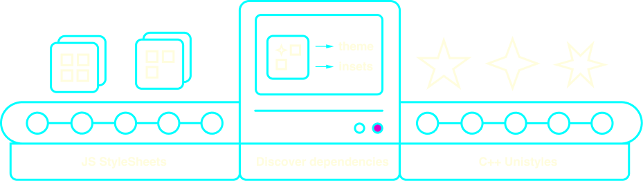
Unistyles workflow
### 5. Reacting to events
[Section titled “5. Reacting to events”](#5-reacting-to-events)
When you access your `StyleSheet` styles in your component, you’ll get a regular JS object as expected. If your component re-renders, we simply return the same `Unistyle` that’s already parsed and stored in the cache.
To visualize the true power of `Unistyles`, imagine that some event occurs, such as:
* A theme change triggered by the user clicking a button
* A phone color scheme change
* A phone orientation change
* Accessibility settings being updated
* and much more! Unistyles can update your styles based on 16 different events
At this point, the Unistyles algorithm scans the `StyleSheetRegistry` and looks for styles that depend on this event:
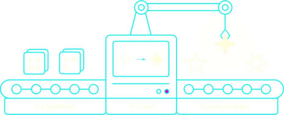
Finding affected styles
Affected styles are then re-computed to reflect the new state of your app.
### 6. Shadow Tree updates
[Section titled “6. Shadow Tree updates”](#6-shadow-tree-updates)
With the list of affected styles, we can now browse the `ShadowRegistry`, where we keep the bindings between `ShadowNode` and `Unistyles`. In other words, we know which `component` relies on which `style`. With all this information, we can translate the update into atomic `ShadowTree` instructions.
With Unistyles 2.0 or any other library, we would need to re-render your entire app to reflect the changes:
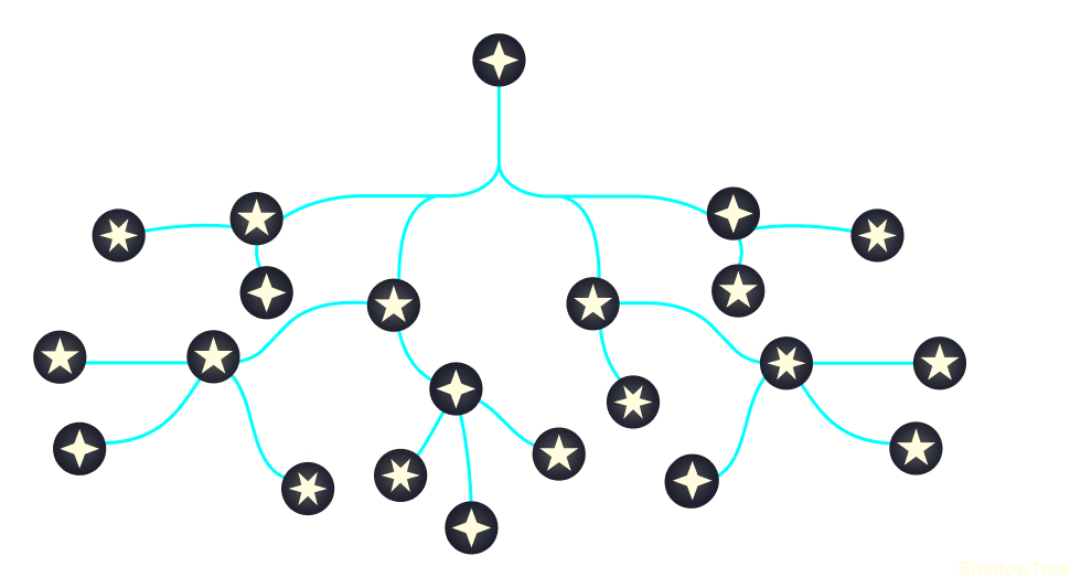
Regular flow: your app is re-rendered
Instead, with all the optimizations and features that Unistyles 3.0 brings, we can target only specific nodes and update your `ShadowTree` directly from C++:
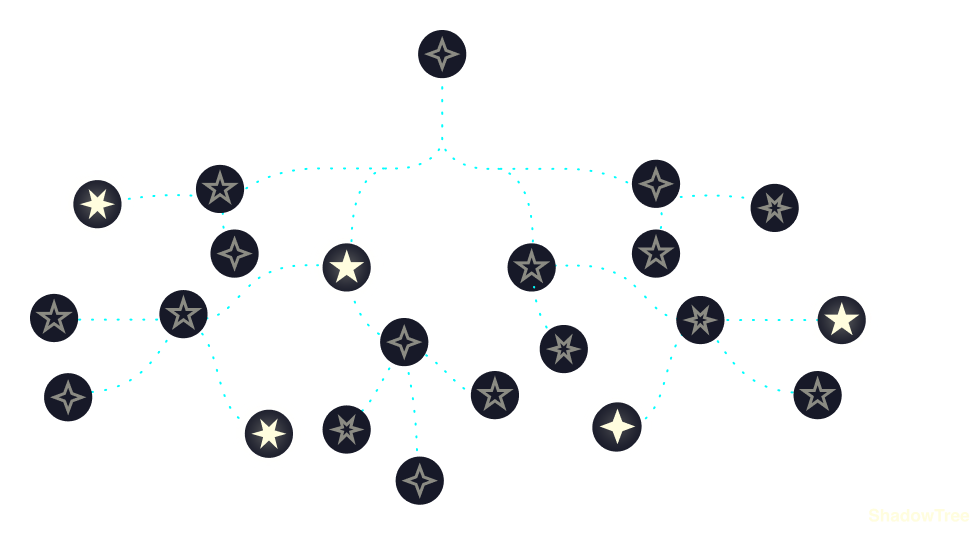
Unistyles 3.0 updates only selected ShadowNodes from C++
With this architecture and the power of selective updates through `ShadowTree`, your components are never re-rendered.
*Engineering is the closest thing to magic that exists in the world.*
\~Elon Musk
# Introduction
> Welcome to Unistyles!

Unistyles is a cross-platform library that enables you to share up to 100% of your styles across all platforms. It combines the simplicity of `StyleSheet` with the performance of `C++`.
**`Unistyles` is a superset of `StyleSheet`** similar to how `TypeScript` is a superset of `JavaScript`. If you’re familiar with styling in React Native, then you already know how to use `Unistyles`.
### Why should you use Unistyles?
[Section titled “Why should you use Unistyles?”](#why-should-you-use-unistyles)
* Guarantees no re-renders across the entire app (no hooks, no context—just pure JSI bindings)
* Doesn’t pollute your native view hierarchy, you can use any component you want
* Includes a cross-platform parser written in C++, ensuring consistent output across all platforms
* Leverages [Nitro Modules](https://nitro.margelo.com/) under the hood (everything is strongly typed!)
* Transforms your `StyleSheets` into enhanced `StyleSheets` with superpowers 🦸🏼♂️ that can access themes, platform-specific values, and more!
* Loved by developers worldwide: 2M+ downloads and over 2.2K stars on GitHub
* Backed by [@jpudysz](https://github.com/jpudysz) since 2023
# Migration guide
> How to migrate from previous version
The migration process is quite simple, but it can be tedious since you’ll need to remove a lot of the existing code.
1. Follow installation steps from [Getting started](/v3/start/getting-started) guide.
2. Replace your configuration with [new](/v3/start/configuration) one.
`UnistylesRegistry` can be easily replaced with `StyleSheet.configure` as it follows the same syntax. `Themes` and `Breakpoints` work exactly the same. For `Settings` we removed 4 out of 6 options:
```diff
-import { UnistylesRegistry } from 'react-native-unistyles'
+import { StyleSheet } from 'react-native-unistyles'
- UnistylesRegistry.addConfig({
- adaptiveThemes: false,
- initialTheme: 'dark',
- plugins: [...],
- experimentalCSSMediaQueries: true,
- windowResizeDebounceTimeMs: 100,
- disableAnimatedInsets: true
- })
+ StyleSheet.configure({
+ settings: {
+ adaptiveThemes: false, // works exactly the same like in 2.0
+ initialTheme: 'dark', // works exactly the same like in 2.0
// plugins are removed, instead transform your styles with static functions
// experimentalCSSMediaQueries: these options is also removed, and enabled by default with custom parser
// windowResizeDebounceTimeMs: removed, there is no debouncing anymore. Styles are updated with CSS media queries
// disableAnimatedInsets: removed, insets won't re-render your views
+ }
+ })
```
3. Import `StyleSheet` from `react-native-unistyles`:
```diff
-import { createStyleSheet, useStyles } from 'react-native-unistyles'
+import { StyleSheet } from 'react-native-unistyles'
```
4. Replace `createStyleSheet` with `StyleSheet.create`:
```diff
-const stylesheet = createStyleSheet(theme => ({
+const stylesheet = StyleSheet.create(theme => ({
```
5. Remove all occurrences of `useStyles` hook:
```diff
-const { styles } = useStyles(stylesheet)
```
6. Rename your `stylesheet` to `styles`:
```diff
-const stylesheet = StyleSheet.create(theme => ({
+const styles = StyleSheet.create(theme => ({
```
7. If you used `useInitialTheme`, remove it and set initial theme in `StyleSheet.configure`:
```tsx
import { StyleSheet } from 'react-native-unistyles'
StyleSheet.configure({
themes,
breakpoints,
settings: {
initialTheme: () => {
// get preferred theme from user's preferences/MMKV/SQL/StanJS etc.
// must be synchronous
return storage.getString('preferredTheme') ?? 'light'
}
}
})
```
8. If you need to access your `theme` in component, refactor it to use `withUnistyles`:
```diff
import { Button } from 'react-native'
-import { useStyles } from 'react-native-unistyles'
+import { withUnistyles } from 'react-native-unistyles'
+const UniButton = withUnistyles(Button, theme => ({
color: theme.colors.primary
+}))
const MyButton = () => {
return
This text is visible on small devices
This text is hidden on big devices
)
}
```
11. If you used `UnistylesProvider`, remove it as it’s not available anymore:
```diff
-import { UnistylesProvider } from 'react-native-unistyles'
-
```
12. If you want to move your component based on keyboard position, use `ime` inset:
```diff
const style = StyleSheet.create({
container: {
paddingBottom: rt.insets.bottom // bottom is no longer dynamic
+paddingBottom: rt.insets.ime
}
})
```
13. Some `UnistylesRuntime` methods have been renamed. Follow TypeScript types to use new names.
14. Some `UnistylesRuntime` methods have been removed:
```diff
-UnistylesRuntime.addPlugin(plugin) // Unistyles has no plugins anymore
-UnistylesRuntime.removePlugin(plugin) // Unistyles has no plugins anymore
-UnistylesRuntime.statusBar.setColor(color) // removed due to Android 15 deprecation
-UnistylesRuntime.navigationBar.setColor(color) // removed due to Android 15 deprecation
```
15. `UnistylesRuntime` methods that accepted `color` and `alpha` have been changed to accept `color` only. Each method supports **any** color that is respected by React Native:
```diff
-UnistylesRuntime.setRootViewBackgroundColor(color, alpha) // no need for separate alpha
+UnistylesRuntime.setRootViewBackgroundColor(color) // accepts any color
```
16. `hairlineWidth` has been moved from `UnistylesRuntime` to `StyleSheet`. Use `StyleSheet.hairlineWidth` instead:
```diff
-UnistylesRuntime.hairlineWidth // no longer available
+StyleSheet.hairlineWidth // matches StyleSheet API
```
17. If your app used variants, move config to `styles.useVariants` instead:
```diff
-import { useStyles } from 'react-native-unistyles'
+import { StyleSheet } from 'react-native-unistyles'
const MyComponent = () => {
-const { styles } = useStyles(stylesheet, {
variant1: 'primary',
variant2: 'secondary'
-})
+styles.useVariants({
variant1: 'primary',
variant2: 'secondary'
+})
return
)
}
const styles = StyleSheet.create((theme, rt) => ({
container: {
flex: 1,
alignItems: 'center',
justifyContent: 'flex-end',
backgroundColor: theme.colors.backgroundColor,
paddingHorizontal: theme.gap(2),
paddingTop: rt.insets.top,
transform: [
{
translateY: rt.insets.ime * -1
}
]
},
input: {
width: '100%',
}
}))
```
In this example, the `container` will automatically adjust to avoid the keyboard, ensuring the `input` remains visible at all times.
# Custom Web
> Learn how to use Unistyles 3.0 without React Native Web
It’s possible to render Unistyles without `react-native-web` dependency by simply creating your own web-only components.
Unfortunately, you still need to install `react-native-web` in order to run your app, because most of the React Native libraries do not work without it.
For this we recommend following the guidelines provided by [Expo](https://docs.expo.dev/workflow/web/).
## How to create custom web components
[Section titled “How to create custom web components”](#how-to-create-custom-web-components)
In order to create custom web components, you need to use `getWebProps` function. It takes a `StyleProp` and returns an object with `className` and `ref` properties.
src/components/Header.tsx
```tsx
import { StyleProp, TextStyle } from 'react-native'
import { getWebProps } from 'react-native-unistyles/web'
type HeaderProps = {
style: StyleProp
children: string
}
export const Header: React.FC = ({ style, children }) => {
const { ref, className } = getWebProps(style)
return (
{children}
)
}
```
Or merge multiple styles:
src/components/Header.tsx
```tsx
import { StyleProp, TextStyle } from 'react-native'
import { StyleSheet } from 'react-native-unistyles'
import { getWebProps } from 'react-native-unistyles/web'
type HeaderProps = {
customStyle: StyleProp
children: string
}
export const Header: React.FC = ({ customStyle, children }) => {
const webProps = getWebProps([customStyle, style.text])
return (
{children}
)
}
const style = StyleSheet.create(theme => ({
text: {
color: theme.colors.text,
_web: {
_hover: {
color: theme.colors.primary,
}
}
}
}))
```
That’s it! Now you can use your custom web components in your app.
Caution
If you’re creating multiplatform app, remember to create a native fallback for your web components.
# Expo Router
> Integrate Expo Router with Unistyles
[Expo Router](https://docs.expo.dev/router/introduction/) is a popular routing library from Expo that is built on top of React Navigation. When using Unistyles with Expo Router, it’s necessary to configure it properly.
### Modify main entry
[Section titled “Modify main entry”](#modify-main-entry)
Expo Router resolves routes differently than expected. Also, Unistyles 3.0 is parsing your `StyleSheets` as soon as you import file containing it. This combination may cause some issues. To prevent that you need to modify your main entry file:
package.json
```diff
{
-"main": "expo-router/entry"
+"main": "index.ts"
}
```
Then, create `index.ts` file with following content:
index.ts
```js
import 'expo-router/entry'
import './unistyles' // <-- file that initializes Unistyles
```
Note
The `unistyles.ts` file is where Unistyles is configured. For more details, refer to the [configuration guide](/v3/start/configuration).
With this setup, we will ensure that Unistyles is initialized before any other component.
### Expo Router Web - Static rendering
[Section titled “Expo Router Web - Static rendering”](#expo-router-web---static-rendering)
Caution
This is the default option since Expo SDK 52.
You can check if you are using static rendering in `app.json`:
app.json
```json
{
"expo": {
"web": {
"bundler": "metro",
"output": "static"
}
}
}
```
For Expo static rendering, every page will be resolved with the root HTML file. Unfortunately, this file is hidden, and you need to create it manually. Please follow the [Expo guide](https://docs.expo.dev/router/reference/static-rendering/#root-html) and add a `+html.tsx` file.
In this file, initialize Unistyles by importing the config file:
+html.tsx
```diff
import React from 'react'
import { ScrollViewStyleReset } from 'expo-router/html'
import { type PropsWithChildren } from 'react'
+import '../unistyles' // <-- file that initializes Unistyles
export default function Root({ children }: PropsWithChildren) {
...
}
```
This ensures that Unistyles is initialized whenever Expo Router renders the next static page.
# Merging styles
> Learn about how to merge styles with Unistyles 3.0
While using Unistyles, it’s crucial to understand how styles need to be merged and why it is so important.
### Introduction
[Section titled “Introduction”](#introduction)
In the early versions of Unistyles 3.0, we tried to solve this issue with a Babel plugin. However, it was too complex to maintain various edge cases (especially with `Pressable`), and developers frequently encountered many `Unistyles: Style is not bound!` errors.
With the new approach, we shift the responsibility of merging styles to the user. In other words, the Babel plugin will no longer convert your style tags from objects to arrays.
### How to merge multiple styles
[Section titled “How to merge multiple styles”](#how-to-merge-multiple-styles)
Unistyles doesn’t provide any extra API for merging styles. Instead, we encourage you to use the `[]` syntax supported by React Native components.
```tsx
My theme is {theme.colors.primary}
)
}
```
Caution
`useUnistyles` is not recommended as it will re-render your component on every change of the theme. Learn more about [useUnistyles](/v3/references/use-unistyles)
### Get the current theme name
[Section titled “Get the current theme name”](#get-the-current-theme-name)
To get the current theme name, import `UnistylesRuntime`:
```tsx
import { UnistylesRuntime } from 'react-native-unistyles'
// access the current theme name in your component
export const UserTheme = () => (
Selected theme is {UnistylesRuntime.themeName}
)
```
### Adaptive themes
[Section titled “Adaptive themes”](#adaptive-themes)
Adaptive themes allow Unistyles to automatically manage the selection of your themes based on device color scheme settings. To enable this, you need to meet two conditions:
* register two themes with reserved names `light` and `dark`:
```tsx
StyleSheet.configure({
themes: {
light: lightTheme,
dark: darkTheme,
// you may have more themes
}
})
```
* Explicitly enable `adaptiveThemes`:
```tsx
StyleSheet.configure({
themes: {
light: lightTheme,
dark: darkTheme
},
settings: {
adaptiveThemes: true
}
})
```
Caution
Setting initial theme and enabling adaptive themes at the same time will throw an error as this options are mutually exclusive.
### Toggle adaptive themes during runtime
[Section titled “Toggle adaptive themes during runtime”](#toggle-adaptive-themes-during-runtime)
To toggle adaptive themes support at any point, use `UnistylesRuntime`:
```tsx
import { UnistylesRuntime } from 'react-native-unistyles'
// toggle support for adaptive themes at any point
export const ToggleAdaptiveThemes = () => (
UnistylesRuntime.setAdaptiveThemes(false)}
/>
)
```
With adaptive themes disabled, you can now manually change the theme.
### Check if adaptive themes are enabled
[Section titled “Check if adaptive themes are enabled”](#check-if-adaptive-themes-are-enabled)
To check if adaptive themes are enabled, use `UnistylesRuntime` again:
```tsx
import { UnistylesRuntime } from 'react-native-unistyles'
// check if you've enabled adaptive themes
export const AdaptiveThemes = () => (
Adaptive themes are {UnistylesRuntime.hasAdaptiveThemes ? 'enabled' : 'disabled'}
)
```
### Get device color scheme
[Section titled “Get device color scheme”](#get-device-color-scheme)
Check your device color preference with `UnistylesRuntime`:
```tsx
import { UnistylesRuntime } from 'react-native-unistyles'
// check the current device scheme preference
export const UserTheme = () => (
My device is using the {UnistylesRuntime.colorScheme} scheme.
)
```
Available options are: `dark`, `light` or `unspecified` for devices that don’t support color schemes.
Caution
Unistyles will read your device settings, not user preferences. It’s not compatible with the React Native `Appearance` module.
If your app’s theme is not changing based on device settings, please refer to the [FAQ](/v3/other/frequently-asked-questions/#adaptive-mode-doesnt-work-for-me)
### Change theme
[Section titled “Change theme”](#change-theme)
To change the theme at any time, simply call `setTheme` function:
```tsx
import { UnistylesRuntime } from 'react-native-unistyles'
// change the theme in any component
export const ChangeTheme = () => (
UnistylesRuntime.setTheme('dark')}
/>
)
```
Caution
Calling this function with enabled adaptive themes will throw an error.
### Update theme during runtime
[Section titled “Update theme during runtime”](#update-theme-during-runtime)
Unistyles allows you to update your theme during runtime. This is useful if you want to show the user interface with default colors and later alter theme based on user preferences.
If you update the currently selected theme, it will be automatically applied, and Unistyles will notify all stylesheets about the change. Otherwise, theme will be updated silently.
To update the theme during runtime, call `updateTheme` function, and return new theme object:
```tsx
import { UnistylesRuntime } from 'react-native-unistyles'
// update the theme at any time
export const UpdateTheme = ({ selectedColors }) => (
UnistylesRuntime.updateTheme('dark', currentTheme => ({
...currentTheme,
colors: {
...currentTheme.colors,
...selectedColors
}
}))}
/>
)
```
### Update rootView background color during runtime
[Section titled “Update rootView background color during runtime”](#update-rootview-background-color-during-runtime)
You can also change dynamically the root view background color with `UnistylesRuntime`:
```tsx
import { UnistylesRuntime } from 'react-native-unistyles'
// update the theme at any time
export const UpdateTheme = ({ selectedColors }) => (
UnistylesRuntime.setRootViewBackgroundColor(theme.colors.primary)}
/>
)
```
Changing rootView background color is useful when your app supports different orientations and you want to match the background color with your theme while transitioning.
Note
Unistyles supports all colors that React Native supports eg. #FFFFFF, rgba(255, 255, 255, 0.5), red etc.
# Why my view doesn't update?
> Learn how to resolve the issue when your view is not updating as expected
If you start working with Unistyles 3.0, it might be unclear why some views are updated while others aren’t. Before diving into this guide, make sure you’ve read the other guides covering the basics of the new Unistyles:
* [Look under the hood](/v3/start/how-unistyles-works)
* [Merging styles](/v3/guides/merging-styles)
* [Babel plugin](/v3/other/babel-plugin)
### Problem 1: Babel
[Section titled “Problem 1: Babel”](#problem-1-babel)
To leverage ShadowTree updates and avoid unnecessary re-renders, Unistyles must process both `StyleSheets` and your components. By default, the Babel plugin looks for `react-native-unistyles` imports and always ignores the `node_modules` folder.
If you separate `StyleSheets` from your components, it’s your responsibility to configure Babel to detect components that lack a Unistyles import. We’ve added plenty of options, so be sure to [check them out](/v3/other/babel-plugin##extra-configuration).
### Problem 2: Dependency detection
[Section titled “Problem 2: Dependency detection”](#problem-2-dependency-detection)
Unistyles will automatically detect all your dependencies for every `StyleSheet`, but there’s a chance you used custom syntax that isn’t covered by the plugin. If Babel fails to detect some style dependencies, they won’t be updated when necessary.
You can easily debug this issue by adding the following Babel plugin configuration:
babel.config.js
```js
module.exports = function (api) {
api.cache(true)
return {
// other config
plugins: [
// other plugins
['react-native-unistyles/plugin', {
root: 'src',
debug: true // add this option
}]
]
}
}
```
Then, restart the Metro server cache and check the console, where you’ll find every file and style with its detected dependencies.
### Problem 3: Non React Native components
[Section titled “Problem 3: Non React Native components”](#problem-3-non-react-native-components)
Unistyles can only update React Native components. If you’re using a third-party component, you’ll need to apply a different strategy. Follow our [decision algorithm](/v3/references/3rd-party-views) to help you choose the best approach.
### Problem 4: Web styles are not applied
[Section titled “Problem 4: Web styles are not applied”](#problem-4-web-styles-are-not-applied)
This issue indicates that the Babel plugin didn’t detect some of your components. Initially, it may seem like native styles are working correctly, but that’s not the case.
On mobile, styles are returned the same way as in React Native. You can always `console.log` them to inspect the parsed values:
mobile
```tsx
export const MyView: React.FunctionComponent = () => {
console.log(styles.container) // { backgroundColor: 'red' }
return (
...
)
}
const styles = StyleSheet.create({
container: {
backgroundColor: 'red'
}
})
```
For the web, styles are not returned directly, as they are converted into CSS classes. If you try to log them, there will be no output:
web
```tsx
export const MyView: React.FunctionComponent = () => {
console.log(styles.container) // {}
return (
...
)
}
const styles = StyleSheet.create({
container: {
backgroundColor: 'red'
}
})
```
That’s why you might mistakenly think the problem is only on the web. Please follow the [Babel config](/v3/other/babel-plugin##extra-configuration) to ensure all your components and StyleSheets are detected correctly.
# How to auto-update 3rd party views?
> Learn how to use Unistyles with 3rd party components
Tip
This is our decision algorithm to ensure best practices for your app.
1. If you’re using `react-native` or `react-native-reanimated` components with `style` prop, avoid doing anything. It will work out of the box.
2. For `react-native` components with `contentContainerStyle` prop, you can use the [withUnistyles](/v3/references/with-unistyles) factory. Wrapping your component in `withUnistyles` will [auto map](/v3/references/with-unistyles#auto-mapping-for-style-and-contentcontainerstyle-props) `contentContainerStyle` prop.
3. If you’re using third-party components and you’re confident they internally use `react-native` components, check the [Babel plugin configuration](/v3/other/babel-plugin#extra-configuration) to see if they can be processed to work out of the box.
4. If that fails, try migrating to the [withUnistyles](/v3/references/with-unistyles) factory. It follows best practices and ensures that only a single component is re-rendered when dependencies change. It’s also recommended to map `react-native` properties like `color` or `trackColor`.
5. If that also fails, follow best practices and use the [useUnistyles](/v3/references/use-unistyles) hook.
# Breakpoints
> Learn about breakpoints in Unistyles 3.0
Breakpoints are user-defined key/value pairs that describe the boundaries of screen sizes. There’s no limit to the number of breakpoints; you can define as many as you want.
### Register breakpoints
[Section titled “Register breakpoints”](#register-breakpoints)
To register your breakpoints, create an object with **any** keys:
unistyles.ts
```tsx
const breakpoints = {
xs: 0,
sm: 576,
md: 768,
lg: 992,
xl: 1200,
superLarge: 2000,
tvLike: 4000
} as const
```
The first breakpoint **must** start with `0`. This is required to simulate CSS cascading, e.g., everything below 576px (`sm` breakpoint) will resolve to `xs` breakpoint.
If you use TypeScript you need to override the library’s type:
```tsx
type AppBreakpoints = typeof breakpoints
declare module 'react-native-unistyles' {
export interface UnistylesBreakpoints extends AppBreakpoints {}
}
```
Finally, to register the breakpoints, call `StyleSheet.configure`:
```tsx
import { UnistylesRegistry } from 'react-native-unistyles'
StyleSheet.configure({
breakpoints
})
```
To learn more, follow the configuration [guide](/v3/start/configuration).
### How to use breakpoints?
[Section titled “How to use breakpoints?”](#how-to-use-breakpoints)
Any style can change based on breakpoints. To do this, change a `value` to an `object`:
```diff
const styles = StyleSheet.create(theme => ({
container: {
flex: 1,
justifyContent: 'center',
alignItems: 'center',
backgroundColor: theme.colors.background,
backgroundColor: {
+// your breakpoints
xs: theme.colors.background,
sm: theme.colors.barbie
+}
},
text: {
color: theme.colors.typography
}
}))
```
You can even use it with nested objects like `transform`, `shadowOffset`, or `filters`:
```ts
const styles = StyleSheet.create(theme => ({
container: {
flex: 1,
justifyContent: 'center',
alignItems: 'center',
backgroundColor: {
xs: theme.colors.background,
sm: theme.colors.barbie
},
transform: [
{
translateX: 100
},
{
scale: {
xs: 1.5,
xl: 0.9
}
}
]
}
}))
```
Breakpoints are also available with [variants](/v3/references/variants/) and [compound variants](/v3/references/compound-variants/).
### Built-in breakpoints `landscape` and `portrait`
[Section titled “Built-in breakpoints landscape and portrait”](#built-in-breakpoints-landscape-and-portrait)
Even if you don’t use custom breakpoints, you can still utilize Unistyles’ predefined breakpoints available on mobile devices: `portrait` and `landscape`.
* `portrait` will resolve to your device’s width in portrait mode
* `landscape` will resolve to your device’s width in landscape mode
Tip
These breakpoints are only available on mobile unless you register your own.
```ts
const styles = StyleSheet.create(theme => ({
container: {
flex: 1,
justifyContent: 'center',
alignItems: 'center',
backgroundColor: {
landscape: theme.colors.background,
portrait: theme.colors.barbie
}
}
}))
```
### Pixel/Point mode for native breakpoints
[Section titled “Pixel/Point mode for native breakpoints”](#pixelpoint-mode-for-native-breakpoints)
By default, Unistyles will use `pixels` for native breakpoints. This means that the breakpoints and [mq](/v3/references/media-queries) will be computed based on mobile screen pixels. You can change this behavior by setting `nativeBreakpointsMode` to `points` in your [configuration](/v3/start/configuration#settings-optional).
If `nativeBreakpointsMode` is set to `points`, all breakpoints and `mq` will be computed based on mobile screen points (screen in pixels divided by pixel ratio).
### Show/Hide your components based on breakpoints
[Section titled “Show/Hide your components based on breakpoints”](#showhide-your-components-based-on-breakpoints)
In order to show or hide your components based on the screen size, you can leverage the `mq` utility and one of the two built-in components: `Display` and `Hide`.
```tsx
import { Display, Hide, mq } from 'react-native-unistyles'
const MyComponent = () => {
return (
This text is visible on small devices
This text is hidden on big devices
)
}
```
You can also access your current breakpoint with `UnistylesRuntime`:
```tsx
import { UnistylesRuntime } from 'react-native-unistyles'
// check the current breakpoint
export const CurrentBreakpoint = () => (
Current breakpoint is {UnistylesRuntime.breakpoint}
)
```
### Get registered breakpoints
[Section titled “Get registered breakpoints”](#get-registered-breakpoints)
Access your registered breakpoints object with `UnistylesRuntime`:
```tsx
import { UnistylesRuntime } from 'react-native-unistyles'
// check the registered breakpoints
export const RegisteredBreakpoints = () => (
My registered breakpoint are {JSON.stringify(UnistylesRuntime.breakpoints)}
)
```
# Compound Variants
> Learn about compound variants in Unistyles 3.0
You can extend your `StyleSheets` even further by using `compound variants`.
Compound variants are a way of applying additional styles when certain conditions are met. This approach simplifies the management of complex styling by reducing redundancy and increasing the flexibility of your `StyleSheets`.
### Basic usage
[Section titled “Basic usage”](#basic-usage)
Let’s say you created a base `Typography` component with the following variants:
```tsx
const styles = StyleSheet.create(theme => ({
baseText: {
fontFamily: theme.fonts.base,
fontWeight: 'normal'
},
themedText: {
variants: {
size: {
small: {
fontSize: 12
},
medium: {
fontSize: 16
},
large: {
fontSize: 20
}
},
isBold: {
true: {
fontWeight: 'bold'
}
},
color: {
primary: {
color: theme.colors.primary
},
secondary: {
color: theme.colors.secondary
},
link: {
color: theme.colors.link
}
}
}
}
}
```
What if you’ve received a new requirement where the text should be underlined when `isBold` is `true` and `color` is `link`? This task could be challenging while using features like [dynamic functions](/v3/references/dynamic-functions/) as you would need to use `if` statements in your `StyleSheet`.
### Usage with Compound variants
[Section titled “Usage with Compound variants”](#usage-with-compound-variants)
With compound variants, it can be achieved in a more concise way:
```tsx
const styles = StyleSheet.create(theme => ({
baseText: {
fontFamily: theme.fonts.base,
fontWeight: 'normal'
},
themedText: {
variants: {
size: {
small: {
fontSize: 12
},
medium: {
fontSize: 16
},
large: {
fontSize: 20
}
},
isBold: {
true: {
fontWeight: 'bold'
}
},
color: {
primary: {
color: theme.colors.primary
},
secondary: {
color: theme.colors.secondary
},
link: {
color: theme.colors.link
}
}
},
compoundVariants: [
{
isBold: true, // when isBold is true
color: 'link', // and color is link
// apply following styles
styles: {
textDecorationLine: 'underline'
// and more styles
}
}
]
}
}
```
Styles from the `compoundVariants` array will take precedence over the styles defined in the `variants` object. You can define multiple `compoundVariants` in the array to handle different combinations of style properties. This allows for more granular control and customization of your component’s appearance.
# Content size category
> Learn about content size category in Unistyles 3.0
Content size category is a user preference used to adjust text size and control content magnification in your app. This feature is especially useful for users with visual impairments or limited vision.
It’s also possible to use these values to build responsive layouts based on native settings rather than screen size.
### iOS
[Section titled “iOS”](#ios)
Unistyles’ implementation is based on [Human Interface Guidelines](https://developer.apple.com/design/human-interface-guidelines/typography#Specifications) and the available values are:
`xSmall`, `Small`, `Medium`, `Large`, `xLarge`, `xxLarge`, `xxxLarge`, `unspecified`
In addition to the above categories, you can also use the [Accessibility sizes](https://developer.apple.com/documentation/uikit/uicontentsizecategory#2901207), and the available values are:
`accessibilityMedium`, `accessibilityLarge`, `accessibilityExtraLarge`, `accessibilityExtraExtraLarge`, `accessibilityExtraExtraExtraLarge`
### Android
[Section titled “Android”](#android)
There is no direct equivalent to the iOS content size category on Android. The implementation is based on [Font Scale](https://developer.android.com/reference/android/content/res/Configuration#fontScale), and the available values are:
`Small`, `Default`, `Large`, `ExtraLarge`, `Huge`
Mapping is based on the following table:
| Value | Font Scale |
| -------------- | ---------- |
| Small | <= 0.85 |
| Default | <= 1.0 |
| Large | <= 1.15 |
| ExtraLarge | <= 1.3 |
| Huge | <=1.5 |
| ExtraHuge | <=1.8 |
| ExtraExtraHuge | >1.8 |
### Web
[Section titled “Web”](#web)
There is no support for the content size category on the web. Reading the value will always resolve to `unspecified`.
### Usage
[Section titled “Usage”](#usage)
To get the current `contentSizeCategory`, you need to use `UnistylesRuntime`:
```tsx
import { UnistylesRuntime } from 'react-native-unistyles'
// check the current content size category
export const ContentSizeCategory = () => (
My device is using the {UnistylesRuntime.contentSizeCategory} size.
)
```
For convenience, the library exposes two enums to map the values mentioned above:
```tsx
import { AndroidContentSizeCategory, IOSContentSizeCategory } from 'react-native-unistyles'
// compare the current content size category based on platform
```
# Dimensions
> Learn about Dimensions in Unistyles 3.0
Unistyles provides rich metadata about your device dimensions. This is useful for creating responsive designs as well as avoiding installing third-party libraries. Every property listed below can be accessed with [UnistylesRuntime](/v3/references/unistyles-runtime). Dimensions are always up to date and are updated based on Unistyles’ core logic, e.g., when the device orientation changes.
### Accessing dimensions
[Section titled “Accessing dimensions”](#accessing-dimensions)
In order to start using the dimensions metadata, you need to import `UnistylesRuntime`:
```tsx
import { UnistylesRuntime } from 'react-native-unistyles'
```
### Screen dimensions
[Section titled “Screen dimensions”](#screen-dimensions)
The most basic dimensions are the screen dimensions. These are the dimensions of the screen that your app is running on. You can access them with the `screen` prop:
```tsx
import { UnistylesRuntime } from 'react-native-unistyles'
UnistylesRuntime.screen.width // eg. 400
UnistylesRuntime.screen.height // eg. 760
```
### Status bar
[Section titled “Status bar”](#status-bar)
You can access status bar dimensions with the `statusBar` prop:
```tsx
import { UnistylesRuntime } from 'react-native-unistyles'
UnistylesRuntime.statusBar.width // eg. 400
UnistylesRuntime.statusBar.height // eg. 24
```
This prop may be useful for creating custom headers. In most of the cases status bar height is equal to the top inset, but on some devices it may be different.
### Navigation bar
[Section titled “Navigation bar”](#navigation-bar)
You can access navigation bar dimensions with `navigationBar` prop:
```tsx
import { UnistylesRuntime } from 'react-native-unistyles'
UnistylesRuntime.navigationBar.width // eg. 400
UnistylesRuntime.navigationBar.height // eg. 24
```
This prop may be useful for creating custom bottom bars. In most of the cases navigation bar height is equal to the bottom inset, but on some devices it may be different.
### Insets
[Section titled “Insets”](#insets)
Insets are the safe areas of the screen. They are used to avoid overlapping with system UI elements such as the status bar, navigation bar, and home indicator. You can access them with `insets` prop:
```tsx
import { UnistylesRuntime } from 'react-native-unistyles'
UnistylesRuntime.insets.top // eg. 42
UnistylesRuntime.insets.bottom // eg. 24
UnistylesRuntime.insets.left // eg. 0, or in vertical orientation can be top inset
UnistylesRuntime.insets.right // eg. 0
UnistylesRuntime.insets.ime // eg. 0
```
Note
Read more about IME insets in keyboard [guide](/v3/guides/avoiding-keyboard/).
Insets can be used directly in your stylesheets to avoid passing values from `useSafeAreaInsets` hook from [react-native-safe-area-context](https://github.com/th3rdwave/react-native-safe-area-context?tab=readme-ov-file#usesafeareainsets) library.
Note
Unistyles uses `WindowsInsetsCompat` API to handle insets on Android. This API requires your app to have edge to edge layout enabled. Read more about it [here](/v3/references/edge-to-edge/).
Insets on Android respect following setups:
```tsx
I will be visible from 'sm' breakpoint and up
)
}
```
You can also use pixel-based values:
```tsx
import React from 'react'
import { View } from 'react-native'
import { Display, mq } from 'react-native-unistyles'
const Component = () => {
return (
I will be visible from 0 to 500px
)
}
```
### Hide
[Section titled “Hide”](#hide)
On the opposite side, the `Hide` component helps you hide its children based on `breakpoints` or `media queries`. It works exactly the same way as the Display component.
```tsx
import React from 'react'
import { View } from 'react-native'
import { Hide, mq } from 'react-native-unistyles'
const Component = () => {
return (
I will be hidden from 'sm' breakpoint to 'lg' breakpoint
)
}
```
Caution
Does it mean that Unistyles introduced a new components?
Well, no! These components are simple if-else statements used to conditionally render your JSX. We won’t wrap your components in any additional layers.
We believe this saves you a lot of time and effort, eliminating the need to implement the logic yourself or causing re-renders by listening to any hooks.
# Dynamic Functions
> Learn about dynamic functions in Unistyles 3.0
If you need to pass a value from JSX to your `stylesheet` you can do so using a concept called `dynamic function`.
### Usage
[Section titled “Usage”](#usage)
To use a dynamic function, change **any** stylesheet’s value from an `object` to a `function`:
```diff
const styles = StyleSheet.create(theme => ({
container: {
container: () => ({
backgroundColor: theme.colors.background,
flex: 1,
justifyContent: 'center',
alignItems: 'center'
-}
})
}))
```
Now, you can pass **any** number of arguments, and all with TypeScript hints:
```tsx
export const Example = ({ maxWidth, isOdd, children }) => {
return (
{children}
)
}
const styles = StyleSheet.create(theme => ({
container: (maxWidth: number, isOdd: boolean) => ({
backgroundColor: theme.colors.background,
flex: 1,
justifyContent: 'center',
alignItems: 'center',
maxWidth,
borderBottomWidth: isOdd ? 1 : undefined
})
}))
```
Serializable arguments
Keep in mind that a dynamic function can accept only serializable arguments. These arguments will be passed to C++, so anything that can be represented as `folly::dynamic` is supported (such as strings, numbers, booleans, arrays, objects, etc.).
# Edge to edge layout with Unistyles
> Learn how Unistyles leverages edge to edge layout
### iOS
[Section titled “iOS”](#ios)
Unistyles uses native `SafeAreaInsets` API to handle insets on iOS. This API is stable and works the same across all iOS versions.
Most likely, you’ll never receive incorrect inset values on iOS.
### Android
[Section titled “Android”](#android)
Unistyles uses `WindowsInsetsCompat` API to handle insets on Android. This API requires your app to have edge to edge layout enabled. In other words, it means that your `StatusBar` is always `translucent` and the app can draw behind the `NavigationBar`. A translucent status bar is also the default when you build your app with Expo. To leverage `WindowInsetsCompat`, Unistyles enables `edgeToEdge` layout by default.
As a result you need to use paddings to draw your app content above system bars. To learn more about `edgeToEdge` layout please check [Window insets in Compose](https://developer.android.com/develop/ui/compose/layouts/insets).
```tsx
import { StyleSheet } from 'react-native-unistyles'
const App = () => (
Correct insets
)
const styles = StyleSheet.create((theme, rt) => ({
container: {
backgroundColor: theme.colors.background,
flex: 1,
// apply insets to the container,
// so it will add required paddings
paddingTop: rt.insets.top,
paddingBottom: rt.insets.bottom,
paddingLeft: rt.insets.left,
paddingRight: rt.insets.right
},
})
```
Edge-to-edge enforcement
Apps are edge-to-edge by default on devices running Android 15 if the app is targeting Android 15 (API level 35).
[Learn more](https://developer.android.com/about/versions/15/behavior-changes-15)
Enable edgeToEdgeEnabled in gradle.properties
We **strongly recommend** setting `edgeToEdgeEnabled=true` in your `android/gradle.properties`. Beyond enabling edge-to-edge layout, it enforces translucent system bars on modals, disables legacy StatusBar hacks, and enables additional React Native core fixes. **Expo SDK 54+** enables this automatically.
Since v3.1.0, `react-native-edge-to-edge` is optional — you can still install it for ecosystem compatibility. Learn more [here](/v3/other/dependencies#react-native-edge-to-edge-optional-since-v310).
# Media Queries
> Learn about media queries in Unistyles 3.0
Media queries provide more power and allow you to style cross-platform apps with pixel-perfect accuracy.
### Basic usage
[Section titled “Basic usage”](#basic-usage)
To use media queries, you need to import the `mq` utility and convert your value to an `object`:
```diff
import { Stylesheet, mq } from 'react-native-unistyles'
const styles = Stylesheet.create(theme => ({
container: {
flex: 1,
justifyContent: 'center',
alignItems: 'center'
backgroundColor: theme.colors.background,
backgroundColor: {
+[mq.only.width(240, 380)]: theme.colors.background,
+[mq.only.width(380)]: theme.colors.barbie
+}
}
}))
```
The `mq` utility provides Intellisense for quickly building your media queries.
### Advanced usage
[Section titled “Advanced usage”](#advanced-usage)
You can also combine `width` media queries with `height` media queries:
```tsx
import { StyleSheet, mq } from 'react-native-unistyles'
const styles = Stylesheet.create(theme => ({
container: {
flex: 1,
justifyContent: 'center',
alignItems: 'center'
backgroundColor: theme.colors.background,
backgroundColor: {
[mq.width(240, 380).and.height(300)]: theme.colors.background,
[mq.width(380).and.height(300)]: theme.colors.barbie
}
}
}))
```
Or use only `height` media queries:
```tsx
import { StyleSheet, mq } from 'react-native-unistyles'
const styles = Stylesheet.create(theme => ({
container: {
flex: 1,
justifyContent: 'center',
alignItems: 'center'
backgroundColor: theme.colors.background,
backgroundColor: {
[mq.only.height(300, 500)]: theme.colors.background,
[mq.only.height(500)]: theme.colors.barbie
}
}
}))
```
You can also reuse your defined [breakpoints](/v3/references/breakpoints/):
```tsx
import { StyleSheet, mq } from 'react-native-unistyles'
const styles = Stylesheet.create(theme => ({
container: {
flex: 1,
justifyContent: 'center',
alignItems: 'center'
backgroundColor: theme.colors.background,
backgroundColor: {
[mq.only.height(500)]: theme.colors.background,
[mq.only.width(200, 'xl')]: theme.colors.barbie
}
}
}))
```
### Reference
[Section titled “Reference”](#reference)
Available combinations
```shell
mq.only.width // target only width
mq.only.height // target only height
mq.width(...).and.height(...) // target both width and height
mq.height(...).and.width(...) // target both height and width
```
Available values
```shell
(100, 200) // from 100 to 199
(400, 'xl') // from 400 to 'xl' breakpoint
('sm', 'md') // from 'sm' to 'md' breakpoint
(undefined, 1000) // from 0 to 999
(null, 800) // from 0 to 799
(500) // from 500 onwards
```
Full example
```shell
mq.only.width(100, 200) // width from 100 to 199
mq.height(500).and.width('sm') // heigh from 500 onwards and width from 'sm' breakpoint onwards
mq.only.height(null, 1000) // height from 0 to 999
```
Tip
If you pass an invalid range to mq utility eg. (‘xl’, ‘sm’) or (500, 200) the media query will be marked as invalid and won’t be used to resolve your styles.
### Combining media queries with breakpoints
[Section titled “Combining media queries with breakpoints”](#combining-media-queries-with-breakpoints)
You can mix media queries with breakpoints, but media queries will always have higher priority:
```tsx
import { StyleSheet, mq} from 'react-native-unistyles'
const styles = Stylesheet.create(theme => ({
container: {
flex: 1,
justifyContent: 'center',
alignItems: 'center'
backgroundColor: {
sm: theme.colors.background,
// Unistyles will firsly resolve to this style, even though 'sm' breakpoint may be also correct
[mq.only.width(200, 'xl')]: theme.colors.barbie
}
}
}))
```
### CSS Media Queries
[Section titled “CSS Media Queries”](#css-media-queries)
`Breakpoints` and `Media Queries` will be auto converted to Web CSS media queries. Learn more about [Web Media Queries](/v3/references/web-styles#how-it-works).
# Mini Runtime
> Learn about mini runtime in Unistyles 3.0
Mini runtime was introduced in Unistyles `2.8.0` as a subset of `UnistylesRuntime` containing only the properties that are useful in your `StyleSheet`.
It doesn’t include any functions, as they aren’t necessary when you’re referencing your platform values.
Mini runtime returns following object:
```tsx
type MiniRuntime = {
readonly themeName?: string, // eg. light or undefined if you haven't registered any themes
readonly breakpoint?: string, // eg. sm or undefined if you haven't registered any breakpoints
readonly hasAdaptiveThemes: boolean, // true if you have enabled adaptive themes
readonly colorScheme: ColorScheme, // eg. light or dark or unspecified
readonly screen: Dimensions, // eg. {width: 1024, height: 768}
readonly contentSizeCategory: string, // eg. Large
readonly insets: Insets, // eg. { top: 28, bottom: 40, left: 0, right: 0 , ime: 0 }
readonly pixelRatio: number, // eg. 3.0
readonly fontScale: number, // eg. 1.5
readonly rtl: boolean // true if your user prefers RTL
readonly statusBar: Dimensions, // eg. { width: 240, height: 20, }
readonly navigationBar: Dimensions // eg. { width: 240, height: 44, }
readonly isPortrait: boolean, // true if your device is in portrait mode
readonly isLandscape: boolean // true if your device is in landscape mode
}
```
Mini runtime is automatically injected when Unistyles resolves a `StyleSheet` that depends on it.
# Scoped Theme
> Learn about scoped theme in Unistyles 3.0
There are cases where you may want to render specific components or screens with a fixed theme. For instance, a `Camera` view might require a dark background for better contrast, even if the user has selected light mode for the app. Other examples include modals, dialogs, or enabling users to preview the app in different themes to choose their preferred one.
To address this, Unistyles 3.0 introduces the concept of a `Scoped Theme`, which allows you to assign a fixed theme to a specific component or screen.
### Usage with named theme
[Section titled “Usage with named theme”](#usage-with-named-theme)
To use scoped theme, you need to import `ScopedTheme` component from `react-native-unistyles`:
```ts
import { ScopedTheme } from 'react-native-unistyles'
```
Scoped theme accepts one of your registered theme names as a prop:
```tsx
// components here will be fixed to dark theme
Hello world
```
You can also nest `ScopedTheme` components:
```tsx
// I will be dark!
Dark
// I will be light!
Light
// I will be dark again!
Dark
```
### Usage with inverted adaptive theme
[Section titled “Usage with inverted adaptive theme”](#usage-with-inverted-adaptive-theme)
You can also use `ScopedTheme` with the `invertedAdaptive` prop. This prop cannot be used together with a named `ScopedTheme`, as these options are mutually exclusive. The purpose of `invertedAdaptive` is to apply the opposite adaptive theme to the one that is currently active.
In other words, if your app supports [adaptive themes](/v3/guides/theming#adaptive-themes) and you use `ScopedTheme` with the `invertedAdaptive` prop, it will apply:
```plaintext
the dark theme when the color scheme is light
the light theme when the color scheme is dark
```
**Use Cases**:
The `invertedAdaptive` prop is useful in scenarios where you want to highlight a specific section of your app by contrasting it with the current theme. For example:
* **Modal dialogs or popups:** Make a modal stand out by using the opposite theme, drawing the user’s attention
* **Preview components:** Show users how your app looks in both light and dark modes by inverting the theme for a preview section
* **Special content areas:** Emphasize warnings, tips, or promotional banners by displaying them with a contrasting theme
By using `invertedAdaptive`, you can create visually distinct areas in your app that improve user experience and accessibility.
```tsx
Text is light when color scheme is dark and dark when color scheme is light
```
You can also nest other `ScopedThemes` inside `ScopedTheme` with `invertedAdaptive` prop.
### Reset
[Section titled “Reset”](#reset)
If you wrap multiple children in `ScopedTheme` you can disable scoped theme for some of them by using `reset` prop:
```tsx
I will be dark!
I will be light again!
I'm dark again
```
### Reading current scoped theme
[Section titled “Reading current scoped theme”](#reading-current-scoped-theme)
Information about the current `ScopedTheme` is temporary and only available during the component render phase.
For the following example, `themeName` will be different based on the place where we access it:
```tsx
import { UnistylesRuntime, ScopedTheme } from 'react-native-unistyles'
const MyComponent = () => {
// themeName will be 'light' here 💥
const themeName = UnistylesRuntime.themeName
return (
I'm scoped
)
}
const ScopedText = ({ children }) => {
// themeName will be 'dark' here ✅
// because we're "inside" of the ScopedTheme
const themeName = UnistylesRuntime.themeName
return (
{children}
)
}
```
If you want to react to changes in the scoped theme, you can use the `useUnistyles` hook or the `withUnistyles` helper:
```tsx
import { useUnistyles, ScopedTheme } from 'react-native-unistyles'
// My parent is wrapped with ScopedTheme invertedAdaptive
const ScopedComponent = () => {
// reading themeName from `useUnistyles` will always log
// correctly parent scoped theme name 🤯
const { rt } = useUnistyles()
return (
{rt.themeName} // light for dark mode, dark for light mode
)
}
// JSX
```
Same goes for the `withUnistyles` helper:
```tsx
import { withUnistyles, ScopedTheme } from 'react-native-unistyles'
const ScopedTextInput = withUnistyles(TextInput, (theme, rt) => ({
// I will always take in count parent scoped theme
color: rt.themeName === 'light'
? theme.colors.text
: theme.colors.background
}))
// My parent is wrapped with ScopedTheme invertedAdaptive
const ScopedComponent = () => {
return (
```
### Scoped Theme with Suspense
[Section titled “Scoped Theme with Suspense”](#scoped-theme-with-suspense)
When using `ScopedTheme` with React’s `Suspense`, there’s an important consideration about component placement due to how React handles suspension and re-rendering.
React Suspense works by catching promises thrown by child components that are waiting for data. When this happens:
1. React pauses rendering and shows the fallback content
2. Components that successfully rendered before the suspension may be reused
3. Parent components might not re-render when the suspended data becomes available
This means if you place `ScopedTheme` above a component that suspends, the scoped theme might not be applied correctly when the component finally renders:
```tsx
// ❌ This won't work correctly
```
Unistyles ScopedTheme is only available during render phase, we decided to not use `React.Context` to keep the API performant and easy to use.
To fix this issue, you can move the `ScopedTheme` inside the suspended component:
```tsx
// ✅ Place ScopedTheme inside the component that suspends
const SuspendedComponent = () => {
const data = useSuspenseQuery(); // This throws a promise
return (
{data.title}
);
};
```
#### Why We Don’t Use React Context
[Section titled “Why We Don’t Use React Context”](#why-we-dont-use-react-context)
The “ideal” solution would be to use React Context for theme propagation, which would work seamlessly with HMR. However, we’ve chosen performance over convenience. Using React Context would introduce additional re-renders and overhead that could impact your app’s performance, especially in complex component trees.
We prioritize keeping the API fast and lightweight, even if it means accepting some development-time limitations with HMR.
# StyleSheet
> Learn about StyleSheet in Unistyles 3.0
`StyleSheet` replaces the old `createStyleSheet` function and aims for 1:1 parity with the React Native API. When we say that Unistyles is a superset of StyleSheet, we mean it! That’s why we are taking it one step further!
### create
[Section titled “create”](#create)
The `create` function supports all styles that React Native’s StyleSheet does, and it also enables some superpowers 🦸🏼♂️. It can parse your `variants`, `compoundVariants` or `dynamic functions` (even if you haven’t configured Unistyles yet!).
Once you register your `themes` and `breakpoints`, it unlocks even more features, like injecting the current `theme` or `miniRuntime` into your stylesheet. It also assists you with TypeScript autocompletion for your styles.
Example usage:
```tsx
import { StyleSheet } from 'react-native-unistyles'
const styles = StyleSheet.create((theme, rt) => ({
container: {
backgroundColor: theme.colors.background,
variants: {
size: {
small: {
width: 100,
height: 100
},
medium: {
width: 200,
height: 200
},
large: {
width: 300,
height: 300
}
},
isPrimary: {
true: {
color: theme.colors.primary
},
default: {
color: theme.colors.secondary
},
special: {
color: theme.colors.special
}
}
}
},
text: {
fontSize: rt.fontScale * 20,
color: {
sm: theme.colors.text,
md: theme.colors.textSecondary
}
})
}))
```
Will be eg. parsed to:
```ts
{
container: {
backgroundColor: '#000',
width: 200,
height: 200,
color: '#ff33aa'
},
text: {
fontSize: 32,
color: 'gold'
}
}
```
Unistyles StyleSheet will automatically react and recalculate your styles if any of your dependencies change. Learn more about it [here](/v3/start/how-unistyles-works).
`StyleSheet.create` supports 3 ways of defining your stylesheets:
#### Static StyleSheet
[Section titled “Static StyleSheet”](#static-stylesheet)
```tsx
import { StyleSheet } from 'react-native-unistyles'
const styles = StyleSheet.create({
container: {
backgroundColor: 'red'
}
})
```
#### Themable StyleSheet
[Section titled “Themable StyleSheet”](#themable-stylesheet)
```tsx
import { StyleSheet } from 'react-native-unistyles'
const styles = StyleSheet.create(theme => ({
container: {
backgroundColor: theme.colors.background
}
}))
```
#### Themable StyleSheet with `miniRuntime`
[Section titled “Themable StyleSheet with miniRuntime”](#themable-stylesheet-with-miniruntime)
```tsx
import { StyleSheet } from 'react-native-unistyles'
const styles = StyleSheet.create((theme, rt) => ({
container: {
backgroundColor: theme.colors.background,
paddingTop: rt.insets.top
}
}))
```
Learn more about `miniRuntime` [here](/v3/references/mini-runtime/).
### configure
[Section titled “configure”](#configure)
`StyleSheet.configure` is used to configure Unistyles. It accepts an object with the following properties:
* `themes` your apps themes
* `breakpoints` your apps breakpoints
* `settings` additional settings
Your themes are scoped across the whole app, unless your limit it with a [scoped themes](/v3/references/scoped-theme/).
The `configure` function **must** be called before you import any component that uses Unistyles StyleSheet.
You can learn more about how to configure Unistyles [here](/v3/start/configuration).
### addChangeListener Since v3.1.0
[Section titled “addChangeListener ”](#addchangelistener)
`StyleSheet.addChangeListener` is an advanced API for integrations, custom hooks, and animation helpers that need to react to runtime dependency updates.
For regular styles, you do not need to use it manually. Unistyles already recalculates `StyleSheet.create` output whenever the relevant dependencies change.
Signature:
```ts
addChangeListener(
onChanged: (dependencies: Array) => void
): () => void
```
The callback receives one or more `UnistyleDependency` values describing what changed. The function returns an unsubscribe callback.
```tsx
import { useEffect } from 'react'
import { StyleSheet, UnistyleDependency } from 'react-native-unistyles'
useEffect(() => {
const dispose = StyleSheet.addChangeListener((dependencies) => {
if (
dependencies.includes(UnistyleDependency.Theme) ||
dependencies.includes(UnistyleDependency.Breakpoints)
) {
// react to theme or breakpoint updates
}
})
return dispose
}, [])
```
### hairlineWidth
[Section titled “hairlineWidth”](#hairlinewidth)
`StyleSheet.hairlineWidth` is a static value representing the smallest value that can be drawn on your device. It’s helpful for borders or dividers.
```tsx
import { StyleSheet } from 'react-native-unistyles'
const styles = StyleSheet.create(theme => ({
container: {
borderBottomWidth: StyleSheet.hairlineWidth,
borderColor: theme.colors.accent
}
}))
```
### compose
[Section titled “compose”](#compose)
Maps to React Native’s [compose function](https://reactnative.dev/docs/stylesheet#compose).
### flatten
[Section titled “flatten”](#flatten)
Maps to React Native’s [flatten function](https://reactnative.dev/docs/stylesheet#flatten).
### absoluteFillObject
[Section titled “absoluteFillObject”](#absolutefillobject)
Returns following object:
```ts
{
position: 'absolute',
left: 0,
top: 0,
right: 0,
bottom: 0
}
```
### absoluteFill
[Section titled “absoluteFill”](#absolutefill)
Returns following object:
```ts
{
position: 'absolute',
left: 0,
top: 0,
right: 0,
bottom: 0
}
```
# Unistyles Runtime
> Learn about Unistyles Runtime in Unistyles 3.0
Unistyles Runtime is a powerful feature that allows you to access platform specific values directly from `JavaScript`. It allows you to skip many dependencies and keep a lot of functionality under one object.
### Usage
[Section titled “Usage”](#usage)
You can import `UnistylesRuntime` from `react-native-unistyles`:
```tsx
import { UnistylesRuntime } from 'react-native-unistyles'
```
and use it anywhere in your code, even outside a React component.
### Available getters
[Section titled “Available getters”](#available-getters)
| Name | Type | Description |
| ------------------- | ------------------------------------------------------------------------- | ----------------------------------------------------------------------------------- |
| colorScheme | string | Get your device’s color scheme. Available options `dark`, `light` or `unspecified` |
| hasAdaptiveThemes | boolean | Indicates if you have enabled [adaptive themes](/v3/guides/theming#adaptive-themes) |
| themeName | string? | Name of the selected theme or `undefined` if you haven’t register any theme |
| breakpoint | string? | Current breakpoint or undefined if you haven’t registered any |
| breakpoints | Object | Your registered breakpoints |
| screen | {width: number, height: number} | Screen dimensions |
| isPortrait | boolean | Indicates if your device is in portrait mode |
| isLandscape | boolean | Indicates if your device is in landscape mode |
| contentSizeCategory | IOSContentSizeCategory or AndroidContentSizeCategory | Your device’s [content size category](/v3/references/content-size-category/) |
| insets | { top: number, bottom: number, left: number, right: number, ime: number } | Device insets which are safe to put content into |
| statusBar | {width: number, height: number} | Status bar dimensions |
| navigationBar | {width: number, height: number} | Navigation bar dimensions (Android only) |
| pixelRatio | number | Pixel density of the device |
| fontScale | number | Font scale of the device |
| rtl | boolean | Indicates if the device is in RTL mode |
| getTheme | (themeName?: string) => Theme | Get theme by name or current theme if name was not specified |
## Setters
[Section titled “Setters”](#setters)
| Name | Type | Description |
| -------------------------- | -------------------------------------------------------------------- | ------------------------------------------------------------------------------ |
| setTheme | (themeName: string) => void | Change the current theme |
| setAdaptiveThemes | (enabled: boolean) => void | Toggle [adaptive themes](/v3/guides/theming#adaptive-themes) |
| updateTheme | (themeName: string, updater: (currentTheme: Theme) => Theme) => void | Update the [theme](/v3/guides/theming/#update-theme-during-runtime) at runtime |
| statusBar.setHidden | (hidden: boolean) => void | Show/hide status bar at runtime |
| navigationBar.setHidden | (hidden: boolean) => void | Show/hide navigation bar at runtime |
| setImmersiveMode | (enabled: boolean) => void | Enable/disable immersive mode (hiding both status and navigation bars) |
| setRootViewBackgroundColor | (color: string) => void | set root view background color |
### Why `UnistylesRuntime` doesn’t re-render my component?
[Section titled “Why UnistylesRuntime doesn’t re-render my component?”](#why-unistylesruntime-doesnt-re-render-my-component)
You should think of `UnistylesRuntime` as a JavaScript object. It’s not a React hook, so it doesn’t re-render your component when eg. screen size or breakpoint changes. Instead it will return up to date value whenever you access it.
If you’re looking for a way to get fresh values and re-render your component, please check [useUnistyles](/v3/references/use-unistyles) hook.
### How to re-render my stylesheets based on `UnistylesRuntime`?
[Section titled “How to re-render my stylesheets based on UnistylesRuntime?”](#how-to-re-render-my-stylesheets-based-on-unistylesruntime)
You can do that while accessing [miniRuntime](/v3/references/mini-runtime/) in your `StyleSheet`:
One example could be reading device width and height:
```tsx
import { StyleSheet } from 'react-native-unistyles'
// your component
const style = StyleSheet.create((theme, rt) => ({
container: {
backgroundColor: theme.colors.background,
width: rt.screen.width,
height: rt.screen.height
}
}))
```
Your `container` style will be auto-recalculated when `screen` changes.
Learn more on how Unistyles [recalculates your styles](/v3/start/how-unistyles-works).
# useUnistyles
> Learn about escape hatch in Unistyles 3.0
Unistyles provides a way to access your app’s theme and runtime within your components through a hook.
Caution
We strongly recommend **not using** this hook, as it will re-render your component on every change. This hook was created to simplify the migration process and should only be used when other methods fail.
Follow our [decision algorithm](/v3/references/3rd-party-views) to learn when to use this hook.
### When to use it?
[Section titled “When to use it?”](#when-to-use-it)
If you’re using `react-native`, or `react-native-reanimated` components, you should avoid this hook. Unistyles updates these views via the ShadowTree without causing **any re-renders**.
Consider using this hook only if:
* You need to update a view in a third-party library like `react-native-blurhash`
* You’ve already tried using [withUnistyles](/v3/references/with-unistyles) without success
* You want to style [navigation](https://reactnavigation.org/) props as `react-navigation` is optimized for that and never re-render your screens
* some libraries like `react-navigation` warns you that only specific children are allowed, so `withUnistyles` is not an option
### How to use it?
[Section titled “How to use it?”](#how-to-use-it)
This is a standard hook that exposes `theme` and `rt` ([runtime](/v3/references/mini-runtime)) properties. You can import it from `react-native-unistyles`:
```tsx
import { useUnistyles } from 'react-native-unistyles'
const MyComponent = () => {
const { theme, rt } = useUnistyles()
return (
// your view
)
}
```
Subscriptions
Unistyles will monitor your destructured props and re-render your component only when the desired value changes. If you use `theme`, it will automatically subscribe to theme changes. Destructuring `rt` won’t create an automatic subscription, as this object contains multiple values that can change frequently during your app’s lifecycle. To create a subscription, you need to use a specific property on the `rt` object, such as `rt.colorScheme` or `rt.screen.width`.
Case 1 - theme only subscription
```tsx
// subscribes to theme changes, rt is not yet used
const { theme, rt } = useUnistyles()
```
vs
Case 2 - theme and insets subscription
```tsx
// subscribes to theme changes
const { theme, rt } = useUnistyles()
rt.insets // reading this value will automatically subscribe to insets changes
```
### Why isn’t it recommended?
[Section titled “Why isn’t it recommended?”](#why-isnt-it-recommended)
We encourage using `withUnistyles` instead because it ensures only a single component is re-rendered instead of multiple components or the entire app. If you use this hook in a root component, you lose all the benefits of ShadowTree updates and trigger full app re-renders on every change.
Learn more about [How Unistyles works?](/v3/start/how-unistyles-works) to understand why this is not ideal.
Another advantage of `withUnistyles` is that it tracks style dependencies, ensuring only components with changed dependencies are re-rendered. In contrast, `useUnistyles` will re-render the component whenever `theme` or `rt` properties change. Note that `runtime` contains multiple values that can change frequently during your app’s lifecycle.
### How to use it correctly?
[Section titled “How to use it correctly?”](#how-to-use-it-correctly)
If you must use this hook, follow these best practices:
#### 1. Use it only for a single component
[Section titled “1. Use it only for a single component”](#1-use-it-only-for-a-single-component)
```tsx
import { useUnistyles } from 'react-native-unistyles'
import Icon from 'react-native-cool-icons/MaterialIcons'
const MyComponent = () => {
const { theme } = useUnistyles()
// Ensure this component has no children
return (
)
}
```
This is allowed because `react-navigation` does not re-render screens on style prop change. Note that using `withUnistyles` instead may generate a warning since `Stack` components won’t allow other external components.
#### 3. Migration from Unistyles 2.0
[Section titled “3. Migration from Unistyles 2.0”](#3-migration-from-unistyles-20)
If you’re migrating from version 2.0 to 3.0, you can use `useUnistyles` to access the theme and runtime in your components. This works similarly to the `useStyles` hook in 2.0. Once migration is complete, refactor your code to align with Unistyles 3.0 principles.
### Bad Practices
[Section titled “Bad Practices”](#bad-practices)
#### 1. Using it with complex components:
[Section titled “1. Using it with complex components:”](#1-using-it-with-complex-components)
```tsx
import { useUnistyles } from 'react-native-unistyles'
import { Blurhash } from 'react-native-blurhash'
const MyComponent = () => {
const { theme } = useUnistyles()
return (
)
}
```
This will re-render multiple components unnecessarily. Instead move `Blurhash` to a separate component and use `useUnistyles` there.
#### 2. Using it at the root level:
[Section titled “2. Using it at the root level:”](#2-using-it-at-the-root-level)
```tsx
import { useUnistyles } from 'react-native-unistyles'
const MyApp = () => {
const { theme } = useUnistyles()
return (
)
}
```
Using the hook at the root level eliminates all Unistyles benefits, causing your app to re-render unnecessarily.
#### 3. Using it with `react-native` components:
[Section titled “3. Using it with react-native components:”](#3-using-it-with-react-native-components)
```tsx
import { useUnistyles } from 'react-native-unistyles'
import { Text } from 'react-native'
const MyComponent = () => {
const { theme } = useUnistyles()
return (
Hello world
)
}
```
This is a bad practice. Unistyles updates `react-native` components through the ShadowTree without re-rendering. Using this hook here will cause unnecessary re-renders. Once again follow our [decision algorithm](/v3/references/3rd-party-views) to learn about another options.
# Variants
> Learn about variants in Unistyles 3.0
Variants helps you to create a more flexible and reusable stylesheet eg. for your base components. You can mix them with other Unistyles features like [media queries](/v3/references/media-queries/) and [breakpoints](/v3/references/breakpoints/).
### Basic usage
[Section titled “Basic usage”](#basic-usage)
Variants are objects that can be nested in any style object:
```tsx
const styles = StyleSheet.create(theme => ({
container: {
backgroundColor: theme.colors.background,
variants: {
// here you can define your variants
}
},
text: {
color: theme.colors.text,
variants: {
// here you can define other variants!
}
}
}))
```
Variants contain `groups` of atomic variants.
To define a group, first you need to name it and then define variants within it:
```tsx
const styles = StyleSheet.create(theme => ({
container: {
flex: 1,
variants: {
color: {},
size: {},
otherGroupName: {}
}
}
}
```
These groups will later be used to select your variants, so remember to name them appropriately.
With the given structure, you can now define your variants that can contain any number of styles. You can also use `breakpoints`, `media queries` or styles like `transform`:
```tsx
const styles = StyleSheet.create(theme => ({
container: {
flex: 1,
variants: {
color: {
primary: {
backgroundColor: theme.colors.primary
},
secondary: {
backgroundColor: theme.colors.secondary
}
},
size: {
small: {
width: 100,
height: 100
},
medium: {
width: 200,
height: 200
},
large: {
width: 300,
height: 300
}
},
otherGroupName: {
// other variants
}
}
}
}
```
### Selecting variants
[Section titled “Selecting variants”](#selecting-variants)
With your named groups, you can now select any variant from your stylesheet using the `useVariants`:
```tsx
import { StyleSheet } from 'react-native-unistyles'
const Component = () => {
styles.useVariants({
color: 'primary',
size: 'small'
})
return (
const Component: React.FunctionComponent = ({ color, size }) => {
styles.useVariants({
color,
size
})
return (
({
trackColor: isDisabled
? theme.colors.disabled
: theme.colors.primary
})}
/>
)
}
```
`uniProps` is a function that receives `theme` and `rt` as arguments. These values will be always up-to-date, so you can use them to map colors or value to new props.
Note
Components that use `uniProps` are also aware of your dependencies. In the example above, `MySwitch` will re-render only when `theme` changes.
### Props resolution priority
[Section titled “Props resolution priority”](#props-resolution-priority)
We will respect your order of prop resolution, applying them with the following priority:
1. Global mappings
2. `uniProps`
3. Inline props
**Example: Modifying a Button**
```ts
// By default, Button is red
const UniButton = withUnistyles(Button, theme => ({
color: theme.colors.red
}))
// `uniProps` have higher priority,
// so the button is orange
({
color: theme.colors.orange
})}
/>
// Inline props have the highest priority,
// so Button is pink
({
color: theme.colors.orange
})}
/>
```
# LLMS
> How to feed LLMS with Unistyles 3.0
Unistyles can feed LLMs with auto-generated documentation:
* [llms.txt](https://www.unistyl.es/llms.txt)
* [short documentation](https://unistyl.es/llms-small.txt)
* [full documentation](https://unistyl.es/llms-full.txt)
# Babel plugin
> How Unistyles babel plugin works?
Unistyles 3.0 relies heavily on the Babel plugin, which helps convert your code in a way that allows binding the `ShadowNode` with `Unistyles`. Before reading this guide, make sure to check the [Look under the hood](/v3/start/how-unistyles-works) guide.
Our golden rule is to never introduce any component that could pollute your native view hierarchy. In other words, if you use a `View`, it will be rendered as-is in the native view hierarchy.
Let’s discuss the responsibilities of the Babel plugin:
### 1. Detecting StyleSheet dependencies
[Section titled “1. Detecting StyleSheet dependencies”](#1-detecting-stylesheet-dependencies)
Each `StyleSheet` is different. One might rely on a `theme`, another on `miniRuntime`, and so on. The same applies to `styles`. Each style depends on different things. For example, you can wrap your app in a `View` that safeguards your app from rendering behind the notch or navigation bar. Another style might be used in your `Typography` component and provides text color based on the apps’ theme.
Should the `Typography` style re-calculate on an `insets` change? Or should the `View` that relies on insets re-render on a theme change?
We don’t think that’s a good idea. The first responsibility of the Babel plugin is to detect all dependencies in your `StyleSheet`. This ensures that only the relevant styles are recalculated when necessary.
```ts
// Babel: depends on theme
const stylesheet = StyleSheet.create(theme => ({
container: {
// Babel: depends on theme
backgroundColor: theme.colors.background
},
text: {
// Babel: static (no dependencies)
fontSize: 12
}
}))
```
```ts
// Babel: depends on theme and miniRuntime
const stylesheet = StyleSheet.create((theme, rt) => ({
container: {
// Babel: depends on theme and insets
paddingTop: rt.insets.top,
paddingBottom: rt.insets.bottom,
backgroundColor: theme.colors.background
},
text: (fontSize: number) => ({
// Babel: depends on theme
color: theme.colors.text,
// Babel: depends on fontScale
fontSize: rt.fontScale >= 3
? fontSize * 1.5
: fontSize * 0.8
})
}))
```
Dependency detection limitation
We put a lot of effort into making dependency detection as accurate as possible, thus we support:
* destructuring of `theme` and `rt` objects
* style’s as functions / arrow functions / objects
* nested ifs and other conditionals
* ternary operators
* logical operators
* binary operators
* and much more…
**What we don’t support**:
* moving functions/arrow functions out of StyleSheet.create
* `theme` and `rt` reassignment to other variables (we don’t track them)
### 2. Attaching unique id to each StyleSheet
[Section titled “2. Attaching unique id to each StyleSheet”](#2-attaching-unique-id-to-each-stylesheet)
This helps us identify your `StyleSheet` while you’re developing your app and trigger multiple `hot-reloads`. Such identification is required to swap your `StyleSheet` with another one, ensuring that you get up-to-date values during reloads. This feature does not affect your app in production, as the bundle never reloads in that environment.
### 3. Component factory (borrowing ref)
[Section titled “3. Component factory (borrowing ref)”](#3-component-factory-borrowing-ref)
This is the most crucial part—without it, Unistyles won’t be able to update your views from C++. In the early versions of Unistyles 3.0, we tried solving this problem by using the `ref` prop, but it wasn’t reliable enough. Many developers use different style syntaxes, making it impossible to support all of them.
Instead, we decided to leave the user’s `ref` as is and transfer the implementation from Babel to our component factory. This way we have more control and we have an unified way of registering your `ShadowNodes`.
The component factory is a function that takes your component and renders it with an overridden `ref` prop:
```ts
const factory = Component => {
doSomething(ref)
}}
onPress={() => {}}
/>
{
doSomething(ref)
}}
onPress={() => {}}
/>
& {
lightColor?: string;
darkColor?: string;
- type?: 'default' | 'title' | 'defaultSemiBold' | 'subtitle' | 'link';
};
export function ThemedText({
style,
lightColor,
darkColor,
-type = 'default',
+type,
...rest
}: ThemedTextProps) {
```
Our component is clean, but we can make it even better! Why are we passing `lightColor` and `darkColor` as props when Unistyles already has access to our app theme?
Let’s remove those props and use the theme object directly.
components/ThemedText.tsx
```diff
import { Text, type TextProps } from 'react-native';
import { StyleSheet, type UnistylesVariants } from 'react-native-unistyles';
+export type ThemedTextProps = TextProps & UnistylesVariants
-export type ThemedTextProps = TextProps & UnistylesVariants & {
- lightColor?: string;
- darkColor?: string;
- };
export function ThemedText({
style,
-lightColor,
-darkColor,
...rest
}: ThemedTextProps) {
return (
-
+
);
}
```
Next, for the `+not_found.tsx` file, we only need to swap the `StyleSheet` import to use Unistyles:
app/+not\_found.tsx
```diff
+import { StyleSheet } from 'react-native-unistyles';
-import { StyleSheet } from 'react-native';
```
### (tabs) folder
[Section titled “(tabs) folder”](#tabs-folder)
This folder contains the layout and screens for your `TabsNavigator`. For the `index.tsx` and `explore.tsx` files, the process is the same: we simply need to replace the standard `StyleSheet` import with the one from Unistyles.
app/(tabs)/index.tsx
```diff
-import { Platform, StyleSheet } from 'react-native';
+import { StyleSheet } from 'react-native-unistyles';
```
For the JSX, we won’t need all these boilerplate components, so we can keep it as simple as possible:
app/(tabs)/index.tsx
```tsx
import { StyleSheet } from 'react-native-unistyles';
import { ThemedText } from '@/components/ThemedText';
import { ThemedView } from '@/components/ThemedView';
export default function HomeScreen() {
return (
Home Screen
);
}
const styles = StyleSheet.create(theme => ({
container: {
flex: 1,
alignItems: 'center',
justifyContent: 'center',
},
}));
```
Repeat the same steps for the `(tabs)/explore.tsx` file.
app/(tabs)/explore.tsx
```tsx
import { StyleSheet } from 'react-native-unistyles';
import { ThemedText } from '@/components/ThemedText';
import { ThemedView } from '@/components/ThemedView';
export default function TabTwoScreen() {
return (
Explore Screen
);
}
const styles = StyleSheet.create(theme => ({
container: {
flex: 1,
alignItems: 'center',
justifyContent: 'center',
},
}));
```
Accessing the Theme
Have you noticed how we access the theme object?
```tsx
const styles = StyleSheet.create(theme => ({ ... }))
```
This approach is slightly different from the standard React Native `StyleSheet.create` API. With Unistyles, your `StyleSheet.create` function will be automatically re-invoked whenever the theme changes, ensuring your styles are always up-to-date.
**If you’re following the tutorial on the web, you might see an error because additional configuration is required for web support. For now, focus on iOS. We’ll show you how to get it working on the web later.**
The most interesting file here is `_layout.tsx`, which configures the `Tabs` navigator. The default code uses the `useColorScheme` hook to dynamically set the `tabBarActiveTintColor`. Since `@react-navigation` components aren’t aware of the Unistyles C++ core, they can’t be updated automatically. We need a way to get the current theme data into our component and trigger a re-render when the theme changes. This is the perfect use case for the `useUnistyles` hook. It subscribes the component to theme changes, giving you access to the theme object and ensuring the component re-renders when the theme is updated.
Note
The `useUnistyles` hook is powerful but should be used selectively, primarily for integrating with third-party components that need to react to theme changes. To help you decide when to use it, we’ve created a [decision algorithm](/v3/references/3rd-party-views)
Let’s refactor tab layout to use our new theme:
app/(tabs)/\_layout.tsx
```diff
import { Tabs } from 'expo-router';
import React from 'react';
-import { Platform } from 'react-native';
-import { HapticTab } from '@/components/HapticTab';
import { IconSymbol } from '@/components/ui/IconSymbol';
-import TabBarBackground from '@/components/ui/TabBarBackground';
-import { Colors } from '@/constants/Colors';
-import { useColorScheme } from '@/hooks/useColorScheme';
+import { useUnistyles } from 'react-native-unistyles';
export default function TabLayout() {
-const colorScheme = useColorScheme();
+const { theme } = useUnistyles();
return (
);
}
```
With these changes, you can now switch your device’s color scheme, and you’ll see the tab bar’s tint color update instantly, powered by Unistyles!
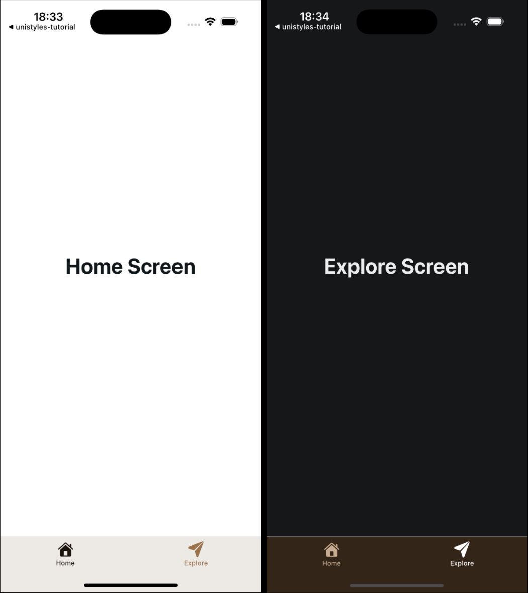
[ Previous](/v3/tutorial/intro)
[Part 1: Intro](/v3/tutorial/intro)
[Next ](/v3/tutorial/cleanup-components)
[Part 3: Cleanup components](/v3/tutorial/cleanup-components)
# Part 8: Cross-platform
> Learn how to build a cross-platform app from scratch with Unistyles 3.0, Expo, and Reanimated
We’re in the final stretch! Our music app is looking great, but there’s one important piece missing. While users can browse songs, navigate between screens, and change theme settings, the accent color selection doesn’t actually work yet. The Button and PlayerControls components still use hardcoded “banana” colors.
In this final part, we’ll connect all the pieces together using a lightweight state management solution, making our app truly dynamic and personalized. We’ll also ensure our app works beautifully across iOS, Android, and Web platforms.
### Adding State Management with StanJS
[Section titled “Adding State Management with StanJS”](#adding-state-management-with-stanjs)
For managing the user’s accent preference across our app, we need a state management solution that’s both lightweight and efficient. After considering various options, we decided to use our in-house library called StanJS.
Note
StanJS is a powerful yet simple state management library that works similarly to `useUnistyles` subscriptions - only components that listen to specific changes will re-render. Learn more at [StanJS Documentation](https://codemask-labs.github.io/stan-js/).
StanJS automatically generates setters for your state values and provides excellent TypeScript support. With just a few lines of code, we can add persistent state management that feels native to our Unistyles-powered app.
### Installation and Setup
[Section titled “Installation and Setup”](#installation-and-setup)
Let’s install StanJS along with MMKV for data persistence:
```bash
yarn add stan-js react-native-mmkv
```
and then regenerate native folders:
```bash
yarn expo prebuild --clean
```
StanJS has built-in MMKV support that makes data persistence effortless.
#### Create the Store
[Section titled “Create the Store”](#create-the-store)
First, let’s set up our store to manage the user’s preferred accent color:
store/store.ts
```tsx
import { Accents } from '@/unistyles'
import { createStore } from 'stan-js'
import { storage } from 'stan-js/storage'
export const { useStore } = createStore({
preferredAccent: storage('banana'),
})
```
The beauty of StanJS lies in its simplicity. To persist data, we just wrap our value in the `storage` helper, which uses MMKV underneath to save the accent preference. StanJS automatically creates a `setPreferredAccent` setter for us - no boilerplate required.
Before we can use our store, we need to create the `Accents` type. Let’s add it to our Unistyles configuration:
unistyles.ts
```diff
// ... existing imports and theme definitions
+export type Accents = keyof typeof lightTheme['colors']['accents']
type AppBreakpoints = typeof breakpoints
type AppThemes = typeof appThemes
declare module 'react-native-unistyles' {
export interface UnistylesThemes extends AppThemes {}
export interface UnistylesBreakpoints extends AppBreakpoints {}
}
// ... rest of configuration
```
This type gives us powerful type safety - TypeScript will know exactly which accent colors are available and prevent us from using invalid accent names.
Now let’s create a barrel export for our store:
store/index.ts
```tsx
export * from './store'
```
### Connecting the Accent Settings
[Section titled “Connecting the Accent Settings”](#connecting-the-accent-settings)
Now we need to update our accent settings screen to actually save the user’s choice to our store. Currently, it only updates local state that gets lost when the user navigates away.
Let’s update the settings screen to use our StanJS store:
app/settings/settings-accent.tsx
```diff
import { Button } from '@/components/Button'
import { ThemedText } from '@/components/ThemedText'
+import { useStore } from '@/store'
import { router } from 'expo-router'
import React, { useState } from 'react'
import { Pressable, ScrollView, View } from 'react-native'
import { StyleSheet, useUnistyles } from 'react-native-unistyles'
export default function SettingsAccentScreen() {
const { theme } = useUnistyles()
+const { setPreferredAccent, preferredAccent } = useStore()
const allAccents = theme.colors.accents
+const [selectedAccent, setSelectedAccent] = useState(preferredAccent)
-const [selectedAccent, setSelectedAccent] = useState('banana')
return (
{Object.entries(allAccents).map(([accentName, accentColor]) => (
{
setSelectedAccent(accentName as keyof typeof allAccents)
}}
>
{accentName}
))}
{
+setPreferredAccent(selectedAccent)
router.back()
}}
/>
)
}
// ... styles remain the same
```
Now we’re importing `useStore` from StanJS and accessing both the `preferredAccent` value and the auto-generated `setPreferredAccent` setter. We initialize our local state with the persisted value, and when the user saves their selection, we update the global store before navigating back.
The beautiful thing about this approach is that any other component that listens for the `preferredAccent` value will automatically re-render when the accent preference changes.
### Making Components Dynamic
[Section titled “Making Components Dynamic”](#making-components-dynamic)
Now let’s update our components to respond to the user’s accent preference instead of using hardcoded values.
#### Update Button Component
[Section titled “Update Button Component”](#update-button-component)
The Button component needs to use the store value as a fallback while still allowing accent overrides:
components/Button.tsx
```diff
import { Pressable } from 'react-native'
import Animated, { useAnimatedStyle, withTiming } from 'react-native-reanimated'
import { StyleSheet, UnistylesVariants } from 'react-native-unistyles'
import { useAnimatedVariantColor } from 'react-native-unistyles/reanimated'
import { ThemedText } from './ThemedText'
+import { useStore } from '@/store'
interface ButtonProps extends UnistylesVariants {
label: string,
onPress(): void
}
export const Button: React.FunctionComponent = ({
label,
accent,
onPress
}) => {
+const { preferredAccent } = useStore()
style.useVariants({
accent: accent ?? preferredAccent
-accent: accent
})
const color = useAnimatedVariantColor(style.buttonColor, 'backgroundColor')
const animatedStyle = useAnimatedStyle(() => ({
backgroundColor: withTiming(color.value, {
duration: 500
})
}))
return (
{label}
)
}
// ... styles remain the same
```
This implementation is flexible - it uses the accent prop if provided (like in the settings preview), but falls back to the user’s preferred accent from the store. This means the “Pick a song” button on the player screen will now use the user’s chosen accent color.
#### Update PlayerControls Component
[Section titled “Update PlayerControls Component”](#update-playercontrols-component)
The PlayerControls component should always use the user’s preferred accent:
components/PlayerControls.tsx
```diff
import { IconSymbol } from '@/components/ui/IconSymbol'
+import { useStore } from '@/store'
import { Pressable, View } from 'react-native'
import { StyleSheet } from 'react-native-unistyles'
import { useUnistyles } from 'react-native-unistyles'
export const PlayerControls = () => {
+const { preferredAccent } = useStore()
const { theme } = useUnistyles()
+const accent = theme.colors.accents[preferredAccent]
-const accent = theme.colors.accents['banana']
return (
)
}
// ... styles remain the same
```
Now the player controls will dynamically change color based on the user’s accent preference. The StanJS subscription ensures that the component re-renders only when the `preferredAccent` value changes.
We need to remove one more `banana` from `[songId].tsx` screen when there is no selected song:
screens/player/\[songId].tsx
```diff
import { Button } from '@/components/Button'
import { PlayerControls } from '@/components/PlayerControls'
import { ThemedText } from '@/components/ThemedText'
import { ThemedView } from '@/components/ThemedView'
import { playlist } from '@/mocks'
import { router, useLocalSearchParams } from 'expo-router'
import { Image, ScrollView } from 'react-native'
import { StyleSheet } from 'react-native-unistyles'
export default function PlayerScreen() {
const { songId } = useLocalSearchParams()
const song = playlist.find(song => song.id === Number(songId))
if (!songId || !song) {
return (
Looking for inspiration?
Pick a song from the playlist
router.replace('/')}
/>
)
}
// ... rest of the file remains the same
```
### Android
[Section titled “Android”](#android)
Now let’s test our app on Android to see if there are any platform-specific issues that need addressing.
Running the app on Android, you’ll notice it works correctly overall, but there’s one issue - the TabBar icons are missing! This happens because our `IconSymbol` component uses iOS-specific SF Symbols that don’t exist on Android.
Let’s fix the icon mappings in our `IconSymbol` component:
components/ui/IconSymbol.tsx
```diff
// ... existing imports and code
const MAPPING = {
-'house.fill': 'home',
-'paperplane.fill': 'send',
-'chevron.left.forwardslash.chevron.right': 'code',
-'chevron.right': 'chevron-right',
+'music.house': 'queue-music',
+'play.circle': 'play-circle-outline',
+'gear.circle': 'settings',
+'backward.end.fill': 'first-page',
+'backward.fill': 'fast-rewind',
+'forward.fill': 'fast-forward',
+'forward.end.fill': 'last-page',
+'play.circle.fill': 'play-circle-filled'
} as IconMapping;
// ... rest of the component
```
These updated mappings use Material Design icons that are available on Android, ensuring our TabBar and player controls display properly across both platforms.
The previous mappings were defaults from the Expo starter template that didn’t match our actual icon usage. With these corrections, your Android app will have proper navigation icons and media controls.
We could also improve the bottom navigation bar by properly configuring `react-native-edge-to-edge` for Android’s gesture navigation, but that’s beyond the scope of this tutorial.
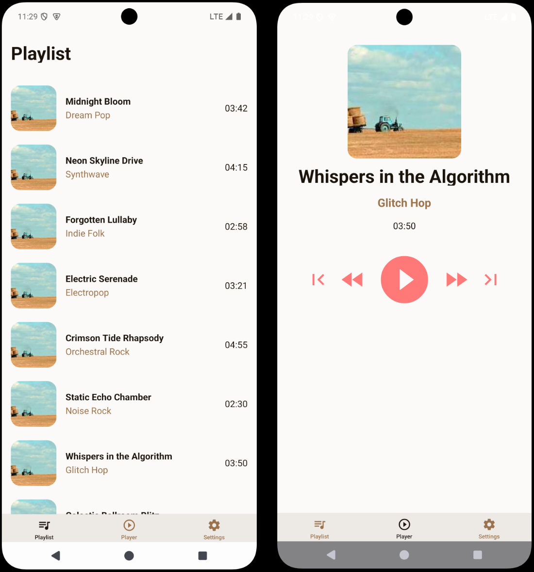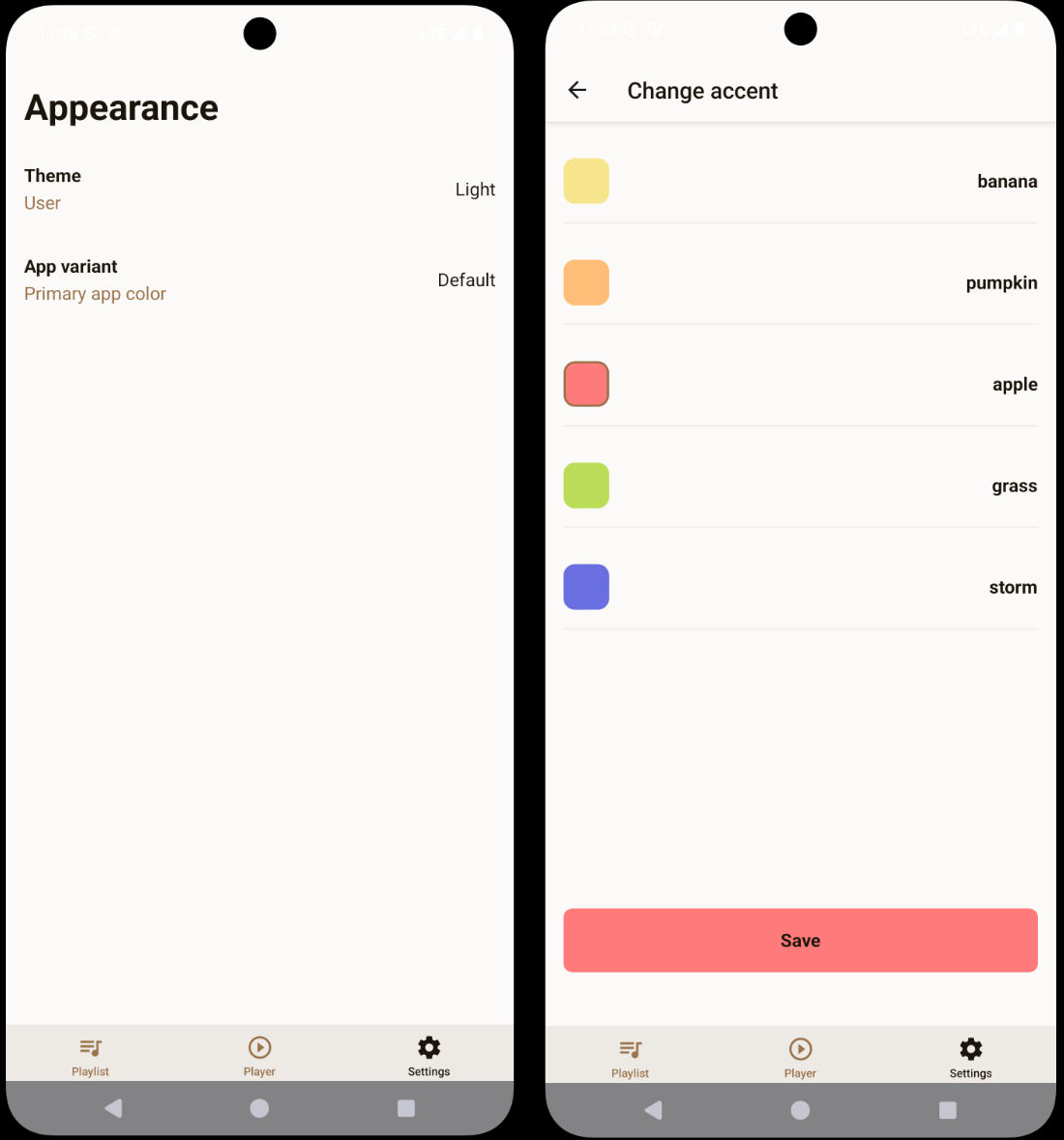
### Web
[Section titled “Web”](#web)
When you try to run your app on the web, you will encounter a crash:
This happens because Expo Router uses static rendering by default, and Unistyles needs to be properly initialized for each page during the static rendering process.
To fix this, we need to create a custom HTML root file that ensures Unistyles is initialized correctly:
app/+html.tsx
```tsx
import { ScrollViewStyleReset } from 'expo-router/html'
import { type PropsWithChildren } from 'react'
import '../unistyles'
// This file is web-only and used to configure the root HTML for every
// web page during static rendering.
// The contents of this function only run in Node.js environments and
// do not have access to the DOM or browser APIs.
export default function Root({ children }: PropsWithChildren) {
return (
{
label: string,
onPress(): void
}
export const SettingOptionRadio: React.FunctionComponent = ({
label,
isSelected,
onPress
}) => {
style.useVariants({
isSelected
})
return (
{label}
{isSelected && (
)
}
const style = StyleSheet.create(theme => ({
container: (state: PressableStateCallbackType) => ({
flexDirection: 'row',
alignItems: 'center',
justifyContent: 'space-between',
gap: 8,
borderRadius: theme.gap(1),
padding: theme.gap(2),
borderWidth: 1,
borderColor: theme.colors.dimmed,
opacity: state.pressed ? 0.75 : 1,
}),
radio: {
width: 24,
height: 24,
borderRadius: 12,
borderWidth: 2,
justifyContent: 'center',
alignItems: 'center',
variants: {
isSelected: {
true: {
borderColor: theme.colors.tint,
},
false: {
borderColor: theme.colors.dimmed,
}
}
}
},
radioInner: {
width: 10,
height: 10,
borderRadius: 5,
backgroundColor: theme.colors.tint,
}
}))
```
This component combines everything we’ve learned: `useVariants` for the radio selection state, boolean variants for styling, `PressableStateCallbackType` for press feedback, and `UnistylesVariants` for type safety.
### Basic Theme Settings Screen
[Section titled “Basic Theme Settings Screen”](#basic-theme-settings-screen)
Let’s add this component to the theme settings screen:
app/settings/settings-theme.tsx
```diff
-import { ThemedText } from '@/components/ThemedText'
+import { SettingOptionRadio } from '@/components/SettingOptionRadio'
+import React from 'react'
import { ScrollView } from 'react-native'
import { StyleSheet } from 'react-native-unistyles'
export default function SettingsThemeScreen() {
return (
-
- Change theme
-
{}}
/>
{}}
/>
)
}
const styles = StyleSheet.create(theme => ({
container: {
flex: 1,
gap: theme.gap(2),
paddingTop: theme.gap(2),
paddingHorizontal: theme.gap(2)
}
}))
```
### Create ThemeColor Component
[Section titled “Create ThemeColor Component”](#create-themecolor-component)
Now let’s create a component called `ThemeColor` that will preview different themes.
components/ThemeColor.tsx
```tsx
import { Pressable } from 'react-native'
import { ScopedTheme, StyleSheet, UnistylesThemes } from 'react-native-unistyles'
import { ThemedText } from './ThemedText'
type ThemeColorProps = {
label: keyof UnistylesThemes,
onPress: VoidFunction
}
export const ThemeColor: React.FunctionComponent = ({ label, onPress }) => {
return (
{label}
)
}
const styles = StyleSheet.create(theme => ({
container: {
flex: 1,
height: 80,
borderRadius: theme.gap(2),
alignItems: 'center',
justifyContent: 'center',
borderWidth: 1,
borderColor: theme.colors.dimmed,
backgroundColor: theme.colors.background
}
}))
```
Here’s were things getting interesting. We’ve used new component called `ScopedTheme`.
`ScopedTheme` empowers you to render child components with a specific, **fixed** theme, regardless of the current global app theme. This feature ensures consistent theming in scenarios like theme previews or within specific screens like camera, where a predetermined visual contract is required.
In other words, if you want some of your components to always use a specific theme, you can use `ScopedTheme`.
Note
Explore the [ScopedTheme guide](/v3/references/scoped-theme) to learn about advanced features such as `invertedAdaptive` and the `reset` functionality.
Before proceeding further, notice that we used `keyof UnistylesTheme` (as label type) to ensure type safety. This type represents the keys of all the themes you’ve registered within Unistyles.
### Enhanced Theme Settings Screen
[Section titled “Enhanced Theme Settings Screen”](#enhanced-theme-settings-screen)
Let’s update the theme settings screen to include theme previews:
app/settings/settings-theme.tsx
```diff
import { SettingOptionRadio } from '@/components/SettingOptionRadio'
+import { ThemeColor } from '@/components/ThemeColor'
import React from 'react'
+import { ScrollView, View } from 'react-native'
-import { ScrollView } from 'react-native'
import { StyleSheet } from 'react-native-unistyles'
export default function SettingsThemeScreen() {
return (
{}}
/>
{}}
/>
+
+ {}}
+ />
+ {}}
+ />
+
)
}
const styles = StyleSheet.create(theme => ({
container: {
flex: 1,
gap: theme.gap(2),
paddingTop: theme.gap(2),
paddingHorizontal: theme.gap(2)
},
row: {
justifyContent: 'center',
flexDirection: 'row',
gap: theme.gap(2)
+}
}))
```
Change your phone’s color scheme and observe that `ScopedTheme` prevents the boxes from re-rendering with the opposite color palette.
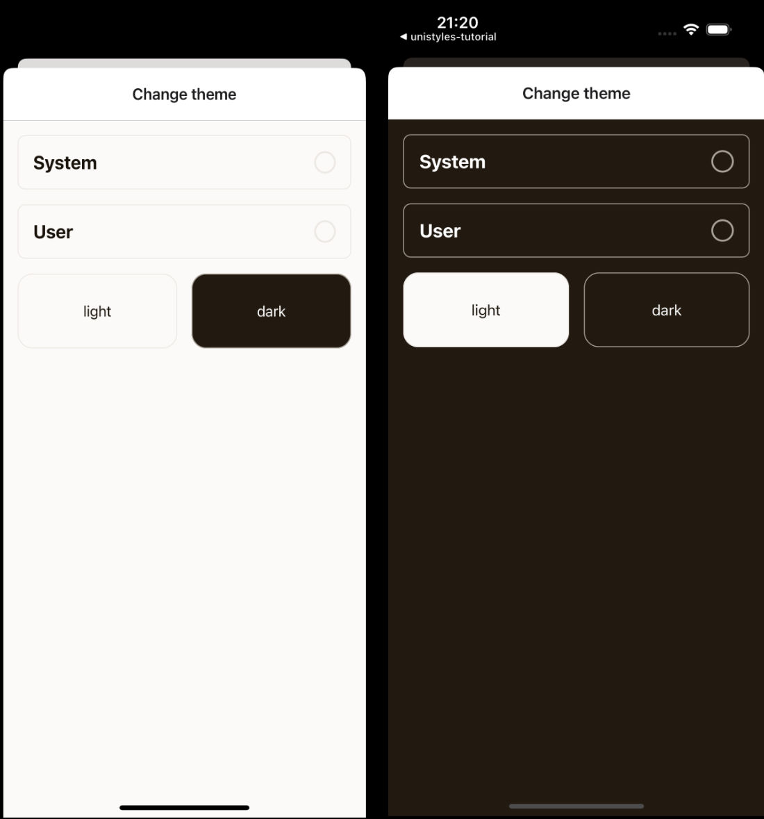
Note
It seems that we need to also update `react-navigation` Header to use Unistyles theme. We will do it before the end of this part of the tutorial.
### Complete Theme Settings Implementation
[Section titled “Complete Theme Settings Implementation”](#complete-theme-settings-implementation)
Now let’s add the full functionality using `UnistylesRuntime` and `useUnistyles`:
app/settings/settings-theme.tsx
```diff
import { SettingOptionRadio } from '@/components/SettingOptionRadio'
import { ThemeColor } from '@/components/ThemeColor'
import React from 'react'
import { ScrollView, View } from 'react-native'
+import { StyleSheet, UnistylesRuntime, useUnistyles } from 'react-native-unistyles'
-import { StyleSheet } from 'react-native-unistyles'
export default function SettingsThemeScreen() {
+const { rt } = useUnistyles()
return (
{
+if (rt.hasAdaptiveThemes) {
+return
+ }
+UnistylesRuntime.setAdaptiveThemes(true)
+ }}
-isSelected={false}
-onPress={() => {}}
/>
{
+if (rt.hasAdaptiveThemes) {
+UnistylesRuntime.setAdaptiveThemes(false)
+ }
+ }}
-isSelected={false}
-onPress={() => {}}
/>
+{!rt.hasAdaptiveThemes && (
UnistylesRuntime.setTheme('light')}
-onPress={() => {}}
/>
UnistylesRuntime.setTheme('dark')}
-onPress={() => {}}
/>
+ )}
)
}
```
Here’s what makes this implementation powerful:
**Using `useUnistyles` for subscriptions**: We use `useUnistyles` to get the `rt` object, which creates a subscription and only re-renders the screen when `hasAdaptiveThemes` changes. Other runtime values won’t trigger unnecessary re-renders.
**Theme management logic**: We can’t change themes when adaptive themes are enabled. Adaptive themes follow the device’s color scheme and automatically switch themes. Allowing manual theme switching would interfere with this system, so we disable theme selection when adaptive themes are active.
**Type-safe theme switching**: `UnistylesRuntime.setTheme()` provides TypeScript hints for all available theme names, making it impossible to set an invalid theme.
Try playing with different settings to see how the app adapts to your choices.
### Update navigation header colors
[Section titled “Update navigation header colors”](#update-navigation-header-colors)
As you probably noticed, navigation header colors are not updated when theme changes. Let’s fix that by updating `app/(tabs)/settings/_layout.tsx` file:
app/(tabs)/settings/\_layout.tsx
```diff
import { Stack } from 'expo-router'
import React from 'react'
import { useUnistyles } from 'react-native-unistyles'
export default function SettingsLayout() {
const { theme } = useUnistyles()
return (
)
}
```
That’s all for theme settings screen!
### Create Button Component
[Section titled “Create Button Component”](#create-button-component)
Now let’s learn something new. We will create an animated button component for the accent settings:
components/Button.tsx
```tsx
import { Pressable } from 'react-native'
import Animated from 'react-native-reanimated'
import { StyleSheet, UnistylesVariants } from 'react-native-unistyles'
import { ThemedText } from './ThemedText'
interface ButtonProps extends UnistylesVariants {
label: string,
onPress(): void
}
export const Button: React.FunctionComponent = ({
label,
accent,
onPress
}) => {
style.useVariants({
accent: accent
})
return (
{label}
)
}
const style = StyleSheet.create(theme => ({
button: {
width: '100%',
padding: theme.gap(2),
justifyContent: 'center',
alignItems: 'center',
borderRadius: theme.gap(1)
},
buttonColor: {
variants: {
accent: {
banana: {
backgroundColor: theme.colors.accents.banana
},
pumpkin: {
backgroundColor: theme.colors.accents.pumpkin
},
apple: {
backgroundColor: theme.colors.accents.apple
},
grass: {
backgroundColor: theme.colors.accents.grass
},
storm: {
backgroundColor: theme.colors.accents.storm
},
default: {
backgroundColor: theme.colors.accents.banana
}
}
}
}
}))
```
You should be familiar with all the patterns used here: variants, `UnistylesVariants` type, and `useVariants` for dynamic styling. So no extra comment is needed. Let’s add few more lines of code to showcase `Reanimated` integration.
components/Button.tsx
```diff
import { Pressable } from 'react-native'
import Animated, { useAnimatedStyle, withTiming } from 'react-native-reanimated'
import { StyleSheet, UnistylesVariants } from 'react-native-unistyles'
+import { useAnimatedVariantColor } from 'react-native-unistyles/reanimated'
import { ThemedText } from './ThemedText'
interface ButtonProps extends UnistylesVariants {
label: string,
onPress(): void
}
export const Button: React.FunctionComponent = ({
label,
accent,
onPress
}) => {
style.useVariants({
accent: accent
})
+const color = useAnimatedVariantColor(style.buttonColor, 'backgroundColor')
+const animatedStyle = useAnimatedStyle(() => ({
backgroundColor: withTiming(color.value, {
duration: 500
+})
+}))
return (
-
+
{label}
)
}
// no changes in styles
```
The `useAnimatedVariantColor` hook allows you to reuse Unistyles variants and easily animate them with Reanimated. You simply pass a style that uses variants and select which color property should be animated. TypeScript automatically hints all available color properties.
The hook returns a `SharedValue` from Reanimated, so you’re free to use any animation logic you want. You’ll see this in action in the next section when we implement the accent settings screen.
With just 5 lines of code, we connected Unistyles to Reanimated and animated the button’s background color based on the selected accent variant.
Before moving on, there’s one crucial point: understanding how to merge styles created by Unistyles.
In the `` component, we used the syntax `[animatedStyle, style.button]` to merge styles. This approach is essential when working with Unistyles. The reason for this specific merging method is that each style managed by Unistyles contains a hidden `JSI NativeState`. This state, stored on the object as an invisible property accessible only via a `Symbol`, is vital for Unistyles’ internal operation. Using the spread operator or other object merging techniques will result in the loss of this state and unpredictable behavior.
For a comprehensive explanation, please refer to our dedicated guide on [Merging styles](/v3/guides/merging-styles).
### Build the Accent Settings Modal
[Section titled “Build the Accent Settings Modal”](#build-the-accent-settings-modal)
Let’s create the final modal screen for accent selection and animate the accent selection:
app/settings/settings-accent.tsx
```tsx
import { Button } from '@/components/Button'
import { ThemedText } from '@/components/ThemedText'
import { router } from 'expo-router'
import React, { useState } from 'react'
import { Pressable, ScrollView, View } from 'react-native'
import { StyleSheet, useUnistyles } from 'react-native-unistyles'
export default function SettingsAccentScreen() {
const { theme } = useUnistyles()
const allAccents = theme.colors.accents
const [selectedAccent, setSelectedAccent] = useState('banana')
return (
{Object.entries(allAccents).map(([accentName, accentColor]) => (
{
setSelectedAccent(accentName as keyof typeof allAccents)
}}
>
{accentName}
))}
{
router.back()
}}
/>
)
}
const styles = StyleSheet.create((theme, rt) => ({
container: {
flex: 1
},
scrollView: {
flex: 1,
gap: theme.gap(2),
paddingTop: theme.gap(2),
paddingHorizontal: theme.gap(2)
},
box: (accentColor: string, isSelected: boolean) => ({
height: 40,
width: 40,
backgroundColor: accentColor,
borderRadius: 10,
borderWidth: isSelected ? 2 : 0,
borderColor: theme.colors.tint
}),
row: {
flexWrap: 'wrap',
flexDirection: 'row',
gap: theme.gap(2)
},
item: {
flexDirection: 'row',
alignItems: 'center',
gap: theme.gap(2),
paddingVertical: theme.gap(2),
width: '100%',
justifyContent: 'space-between',
borderBottomWidth: 1,
borderBottomColor: theme.colors.dimmed
},
buttonContainer: {
marginBottom: rt.insets.bottom,
paddingHorizontal: theme.gap(2)
}
}))
```
This screen uses `useUnistyles` to subscribe to theme changes, allowing us to iterate over all available accent colors. Users can select different accents by tapping the colored boxes, and the selection updates the local state.
The `Button` component animates beautifully thanks to the `useAnimatedVariantColor` hook, with a smooth 500ms transition between different accent colors.
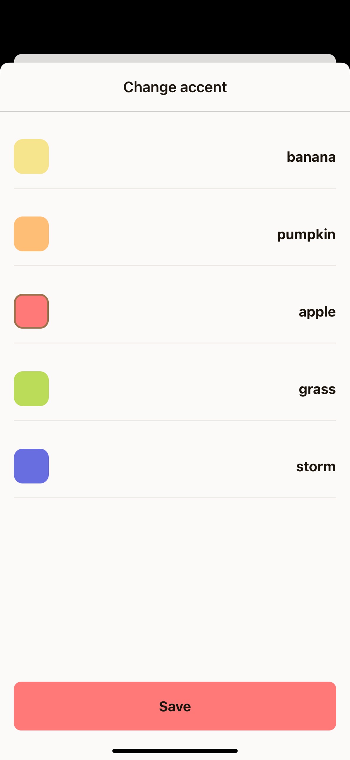
Perfect! You now have fully functional modal screens that demonstrate the power of Unistyles’ theming system. Users can switch between system and manual theme modes, select different themes, and choose from various accent colors - all with smooth animations and immediate visual feedback.
[ Previous](/v3/tutorial/settings-screen)
[Part 5: Settings screen](/v3/tutorial/settings-screen)
[Next ](/v3/tutorial/player-screens)
[Part 7: Player screens](/v3/tutorial/player-screens)
# Part 4: New screens
> Learn how to build a cross-platform app from scratch with Unistyles 3.0, Expo, and Reanimated
With the initial repository cleanup complete, we’re ready to build the screens for our app.
Our application will feature three primary screens, with the Settings screen also containing two modals:
* **PlaylistScreen**: The main screen to display a list of songs
* **PlayerScreen**: A screen to display the currently playing song
* **SettingsScreen**: A screen with options to customize the app
* **SettingsThemeScreen**: A modal for changing the app’s theme
* **SettingsAccentScreen**: A modal for changing the app’s accent color
### PlaylistScreen
[Section titled “PlaylistScreen”](#playlistscreen)
First, let’s repurpose the existing `app/(tabs)/index.tsx` file to become our `PlaylistScreen`. This involves changing the component name from `HomeScreen` to `PlaylistScreen` and wrapping the content in a `ScrollView`:
app/(tabs)/index.tsx
```diff
+import { ScrollView } from 'react-native';
import { ThemedText } from '@/components/ThemedText'
import { ThemedView } from '@/components/ThemedView'
import { StyleSheet } from 'react-native-unistyles'
+export default function PlaylistScreen() {
-export default function HomeScreen() {
return (
+
-
Home Screen
-
+
);
}
const styles = StyleSheet.create(theme => ({
container: {
flex: 1,
alignItems: 'center',
justifyContent: 'center',
}
}));
```
Next, let’s update the title and adjust the container styles. We’ll remove the centering styles for now, as we want our content to start from the top.
app/(tabs)/index.tsx
```diff
import { ThemedText } from '@/components/ThemedText'
import { ScrollView } from 'react-native'
import { StyleSheet } from 'react-native-unistyles'
export default function PlaylistScreen() {
return (
- Home Screen
+ Playlist
);
}
const styles = StyleSheet.create(theme => ({
container: {
flex: 1,
alignItems: 'center',
justifyContent: 'center',
},
}));
```
Oops! We have a problem. Our title has no padding, and the phone’s notch is overlapping it.
Unistyles to the rescue! We don’t need to rely on any other package or hook to handle this. Remember the `rt` object from `StyleSheet.create`? It contains useful device metadata, including `rt.insets`.
Safe area insets define the portion of the view that is unobscured by system elements like notches or the home indicator. With Unistyles, you have direct access to these values:
* top
* bottom
* left
* right
* ime (an animated inset that changes when the keyboard is shown)
Let’s use `rt.insets.top` to add a top margin to our container, pushing the content below the notch:
app/(tabs)/index.tsx
```diff
+const styles = StyleSheet.create((theme, rt) => ({
const styles = StyleSheet.create(theme => ({
container: {
flex: 1,
marginTop: rt.insets.top,
},
}));
```
To give our content some breathing room, let’s also add horizontal padding using our theme’s spacing system:
app/(tabs)/index.tsx
```diff
+const styles = StyleSheet.create((theme, rt) => ({
container: {
flex: 1,
marginTop: rt.insets.top,
paddingHorizontal: theme.gap(2),
},
}));
```
### PlayerScreen
[Section titled “PlayerScreen”](#playerscreen)
For the `PlayerScreen`, we’ll start by creating a new file structure and then use a modified version of our `PlaylistScreen` code.
Expo Router uses a file-based routing system. To create a dynamic route for our player, create the following folder and file:
* app/
* (tabs)/
* player/
* \[songId].tsx
* \_layout.tsx
* index.tsx
* \_layout.tsx
* +not-found.tsx
Now, populate `app/(tabs)/player/[songId].tsx` with the following code. It’s very similar to `PlaylistScreen`, but with the title changed to “Player”.
app/(tabs)/player/\[songId].tsx
```tsx
import { ThemedText } from '@/components/ThemedText'
import { ScrollView } from 'react-native'
import { StyleSheet } from 'react-native-unistyles'
export default function PlayerScreen() {
return (
Player
);
}
const styles = StyleSheet.create((theme, rt) => ({
container: {
flex: 1,
marginTop: rt.insets.top,
paddingHorizontal: theme.gap(2)
},
}));
```
Note
Don’t worry about the TabBar icons and routing just yet - we’ll fix that soon!
### SettingsScreen
[Section titled “SettingsScreen”](#settingsscreen)
The `SettingsScreen` is our final main screen. It will serve as a hub for navigating to the modal screens where users can change the app’s theme and accent color.
First, set up the required files and folders:
* app/
* settings/
* \_layout.tsx
* index.tsx
* settings-theme.tsx
* settings-accent.tsx
* (tabs)/
* player/
* \[songId].tsx
* \_layout.tsx
* index.tsx
* \_layout.tsx
* +not-found.tsx
This is a standard Expo Router stack layout. Let’s add the code for each of these new files.
#### 1. Configure the Stack Navigator (\_layout.tsx)
[Section titled “1. Configure the Stack Navigator (\_layout.tsx)”](#1-configure-the-stack-navigator-_layouttsx)
This file configures the stack navigator for the settings section, defining the main screen and the two modal screens.
app/settings/\_layout.tsx
```tsx
import { Stack } from 'expo-router'
import React from 'react'
import { useUnistyles } from 'react-native-unistyles'
export default function SettingsLayout() {
const { theme } = useUnistyles()
return (
)
}
```
#### 2. Create the Main Settings Screen (index.tsx)
[Section titled “2. Create the Main Settings Screen (index.tsx)”](#2-create-the-main-settings-screen-indextsx)
This is the main `SettingsScreen`. The code is almost identical to our other screens for now.
app/settings/index.tsx
```tsx
import { ThemedText } from '@/components/ThemedText'
import { ScrollView } from 'react-native'
import { StyleSheet } from 'react-native-unistyles'
export default function SettingsScreen() {
return (
Settings
);
}
const styles = StyleSheet.create((theme, rt) => ({
container: {
flex: 1,
marginTop: rt.insets.top,
paddingHorizontal: theme.gap(2)
},
}));
```
#### 3. Create the Modal Screens
[Section titled “3. Create the Modal Screens”](#3-create-the-modal-screens)
The modal screens for changing the theme and accent color are also simple placeholders. Notice the component names and titles are updated for each.
app/settings/settings-theme.tsx
```tsx
import { ThemedText } from '@/components/ThemedText'
import { ScrollView } from 'react-native'
import { StyleSheet } from 'react-native-unistyles'
export default function SettingsThemeScreen() {
return (
Change theme
);
}
const styles = StyleSheet.create((theme, rt) => ({
container: {
flex: 1,
marginTop: rt.insets.top,
paddingHorizontal: theme.gap(2)
},
}));
```
app/settings/settings-accent.tsx
```tsx
import { ThemedText } from '@/components/ThemedText'
import { ScrollView } from 'react-native'
import { StyleSheet } from 'react-native-unistyles'
export default function SettingsAccentScreen() {
return (
Change accent
);
}
const styles = StyleSheet.create((theme, rt) => ({
container: {
flex: 1,
marginTop: rt.insets.top,
paddingHorizontal: theme.gap(2)
},
}));
```
You should now be able to navigate to all three screens, each with a different title but the same basic layout.
### TabBar
[Section titled “TabBar”](#tabbar)
Currently, `TabBar` doesn’t reflect our new screen structure. Let’s update `app/(tabs)/_layout.tsx` to correctly register our routes and assign new icons.
app/(tabs)/\_layout.tsx
```diff
import { IconSymbol } from '@/components/ui/IconSymbol'
import { Tabs } from 'expo-router'
import React from 'react'
import { useUnistyles } from 'react-native-unistyles'
export default function TabLayout() {
const { theme } = useUnistyles()
return (
);
}
```
Congratulations! You’ve successfully set up the basic screen structure and navigation for the app. The boilerplate is out of the way, and we’re ready to start bringing the designs to life in the next part!
[ Previous](/v3/tutorial/cleanup-components)
[Part 3: Cleanup components](/v3/tutorial/cleanup-components)
[Next ](/v3/tutorial/settings-screen)
[Part 5: Settings screen](/v3/tutorial/settings-screen)
# Part 7: Player screens
> Learn how to build a cross-platform app from scratch with Unistyles 3.0, Expo, and Reanimated
Now that we have our settings system in place, it’s time to build the heart of our music app - the playlist and player screens. We’ll create a complete music browsing experience with proper TypeScript types, mock data, and dynamic navigation between screens.
By the end of this part, you’ll have a functional music app that displays a list of songs and allows users to navigate to a detailed player view for each track.
### Setting Up Types and Mock Data
[Section titled “Setting Up Types and Mock Data”](#setting-up-types-and-mock-data)
Before we can build our screens, we need to establish the data structure for our songs. This step is crucial for maintaining type safety throughout our application and ensuring that our components receive the expected data format.
Let’s start by creating the fundamental types that will power our music app.
#### Create Song Types
[Section titled “Create Song Types”](#create-song-types)
First, we’ll define what a song looks like in our application. Each song needs essential information like title, genre, cover image, and duration.
Create `types/song.ts`:
types/song.ts
```tsx
export type Song = {
id: number,
title: string,
genre: string,
imageUrl: string,
duration: string
}
export type Playlist = Array
```
Now let’s create an index file to make imports cleaner throughout our app.
Create `types/index.ts`:
types/index.ts
```tsx
export * from './song'
```
#### Create Mock Playlist Data
[Section titled “Create Mock Playlist Data”](#create-mock-playlist-data)
For this tutorial, we’ll use a curated list of 20 fictional songs with diverse genres to showcase our app’s capabilities. In a real application, this data would come from an API or music service.
Create `mocks/playlist.ts`:
mocks/playlist.ts
```tsx
import { Playlist } from '@/types'
export const playlist: Playlist = [
{
"id": 1,
"title": "Midnight Bloom",
"genre": "Dream Pop",
"imageUrl": "https://picsum.photos/200/300",
"duration": "03:42"
},
{
"id": 2,
"title": "Neon Skyline Drive",
"genre": "Synthwave",
"imageUrl": "https://picsum.photos/200/300",
"duration": "04:15"
},
{
"id": 3,
"title": "Forgotten Lullaby",
"genre": "Indie Folk",
"imageUrl": "https://picsum.photos/200/300",
"duration": "02:58"
},
{
"id": 4,
"title": "Electric Serenade",
"genre": "Electropop",
"imageUrl": "https://picsum.photos/200/300",
"duration": "03:21"
},
{
"id": 5,
"title": "Crimson Tide Rhapsody",
"genre": "Orchestral Rock",
"imageUrl": "https://picsum.photos/200/300",
"duration": "04:55"
},
{
"id": 6,
"title": "Static Echo Chamber",
"genre": "Noise Rock",
"imageUrl": "https://picsum.photos/200/300",
"duration": "02:30"
},
{
"id": 7,
"title": "Whispers in the Algorithm",
"genre": "Glitch Hop",
"imageUrl": "https://picsum.photos/200/300",
"duration": "03:50"
},
{
"id": 8,
"title": "Galactic Ballroom Blitz",
"genre": "Space Disco",
"imageUrl": "https://picsum.photos/200/300",
"duration": "04:38"
},
{
"id": 9,
"title": "Shadows of Yesterday",
"genre": "Gothic Rock",
"imageUrl": "https://picsum.photos/200/300",
"duration": "02:45"
},
{
"id": 10,
"title": "Renegade Heartbeat",
"genre": "Punk Rock",
"imageUrl": "https://picsum.photos/200/300",
"duration": "02:45"
},
{
"id": 11,
"title": "Emerald City Blues",
"genre": "Jazz Fusion",
"imageUrl": "https://picsum.photos/200/300",
"duration": "04:05"
},
{
"id": 12,
"title": "Lunar Labyrinth",
"genre": "Ambient Techno",
"imageUrl": "https://picsum.photos/200/300",
"duration": "05:00"
},
{
"id": 13,
"title": "Stone Cold Symphony",
"genre": "Hard Rock",
"imageUrl": "https://picsum.photos/200/300",
"duration": "03:33"
},
{
"id": 14,
"title": "Celestial Caravan",
"genre": "World Music",
"imageUrl": "https://picsum.photos/200/300",
"duration": "04:22"
},
{
"id": 15,
"title": "Velvet Revolution",
"genre": "Soul",
"imageUrl": "https://picsum.photos/200/300",
"duration": "02:17"
},
{
"id": 16,
"title": "Binary Sunset Dreams",
"genre": "Chillwave",
"imageUrl": "https://picsum.photos/200/300",
"duration": "03:08"
},
{
"id": 17,
"title": "Rusted Gears and Broken Hearts",
"genre": "Industrial",
"imageUrl": "https://picsum.photos/200/300",
"duration": "04:48"
},
{
"id": 18,
"title": "Sapphire Rain Dance",
"genre": "Trance",
"imageUrl": "https://picsum.photos/200/300",
"duration": "02:51"
},
{
"id": 19,
"title": "Concrete Jungle Ballad",
"genre": "Hip Hop",
"imageUrl": "https://picsum.photos/200/300",
"duration": "03:19"
},
{
"id": 20,
"title": "Infinite Horizons Calling",
"genre": "Progressive Metal",
"imageUrl": "https://picsum.photos/200/300",
"duration": "04:30"
}
]
```
We’re using placeholder images from Picsum Photos, which provides random images perfect for mockups. Each song has a unique ID that we’ll use for navigation, and the variety of genres will help showcase how our components handle different types of content.
Create the barrel export for mocks:
mocks/index.ts
```tsx
export * from './playlist'
```
This gives us clean access to our mock data throughout the application with simple imports.
### Building the Playlist Screen
[Section titled “Building the Playlist Screen”](#building-the-playlist-screen)
Now that we have our data structure in place, let’s transform the placeholder home screen into a proper playlist that displays our collection of songs. The playlist will serve as the main entry point where users can browse and select tracks.
Currently, our home screen at `app/(tabs)/index.tsx` just displays a simple title. We need to replace this with a scrollable list of songs that users can interact with.
Let’s update the playlist screen to display our songs:
app/(tabs)/index.tsx
```diff
+import { SongTile } from '@/components/SongTile'
import { ThemedText } from '@/components/ThemedText'
+import { playlist } from '@/mocks'
+import { router } from 'expo-router'
+import { ScrollView, View } from 'react-native'
-import { ScrollView } from 'react-native'
import { StyleSheet } from 'react-native-unistyles'
export default function PlaylistScreen() {
return (
+
+
+
+
+ Playlist
+
+
+{playlist.map(song => (
+ router.push(`/(tabs)/player/${song.id}`)}
+key={song.id}
+ />
+ ))}
+
+
-
-
- Playlist
-
-
);
}
+const styles = StyleSheet.create((theme, rt) => ({
container: {
marginTop: rt.insets.top + theme.gap(3),
backgroundColor: theme.colors.background
+},
contentContainer: {
gap: theme.gap(3),
paddingHorizontal: theme.gap(2)
+},
header: {
paddingBottom: theme.gap(2)
+}
+}));
-const styles = StyleSheet.create((theme, rt) => ({
container: {
flex: 1,
marginTop: rt.insets.top,
paddingHorizontal: theme.gap(2)
-},
-}));
```
Here’s what we’ve changed and why:
**Layout structure**: We now use a `View` container with a `ScrollView` inside, rather than just a `ScrollView`. This gives us better control over the layout and background colors.
**Data integration**: We’re mapping over our playlist array to create a `SongTile` for each song. This approach is scalable and will automatically adapt if we add or remove songs from our playlist.
**Navigation logic**: Each `SongTile` receives an `onPress` callback that navigates to the player screen with the specific song ID. We’re using Expo Router’s dynamic routing with the pattern `/(tabs)/player/${song.id}`.
**Styling considerations**: Notice that we don’t need to wrap the `ScrollView` with `withUnistyles` this time. Unlike in the settings screen, we’re not using any dynamic styles in the `contentContainer` style that need to react to theme changes - just static spacing and padding values.
The key difference is that we’re now structuring our app to handle a list of data items, each with its own navigation destination.
### Creating the SongTile Component
[Section titled “Creating the SongTile Component”](#creating-the-songtile-component)
The `SongTile` component will be responsible for displaying individual song information in an attractive, tappable format. This component needs to show the song’s cover art, title, genre, and duration in a clean layout.
Before our playlist screen can work, we need to create the `SongTile` component that will display each song:
components/SongTile.tsx
```tsx
import { Song } from '@/types'
import { Image, Pressable, View } from 'react-native'
import { StyleSheet } from 'react-native-unistyles'
import { ThemedText } from './ThemedText'
type SongProps = {
song: Song,
onPress(): void
}
export const SongTile: React.FunctionComponent = ({ song, onPress }) => {
return (
{song.title}
{song.genre}
{song.duration}
)
}
const style = StyleSheet.create(theme => ({
container: {
flexDirection: 'row',
gap: theme.gap(2),
alignItems: 'center'
},
image: {
width: 80,
height: 80,
borderRadius: theme.gap(2)
},
textContainer: {
flex: 1
}
}))
```
This component follows the patterns we’ve established throughout the tutorial and you should understand it fully.
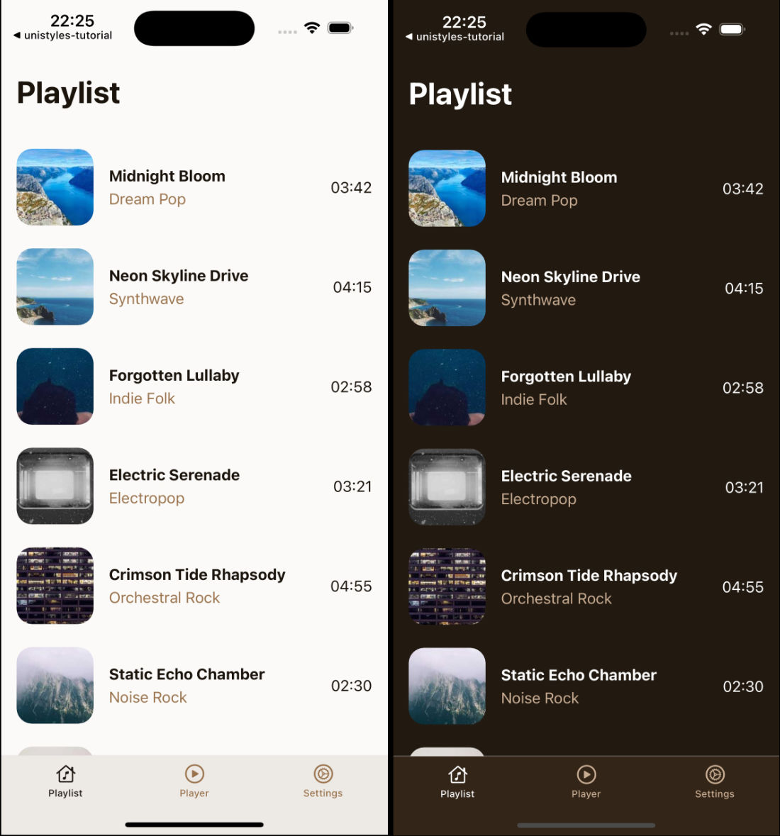
We now have a fully functional playlist screen that displays our 20 mock songs in an attractive list format. Each song shows its cover art, title, genre, and duration. Tapping any song will navigate to the player screen with that specific song’s ID. Screen properly handles safe areas and maintains our app’s theme consistency.
### Building the Player Screen
[Section titled “Building the Player Screen”](#building-the-player-screen)
The player screen needs to handle dynamic routing, where the song ID comes from the URL parameter. This screen will display detailed information about the selected song and provide playback controls.
Let’s update our player screen at `app/(tabs)/player/[songId].tsx` to handle the dynamic song data:
app/(tabs)/player/\[songId].tsx
```diff
+import { Button } from '@/components/Button'
+import { PlayerControls } from '@/components/PlayerControls'
import { ThemedText } from '@/components/ThemedText'
+import { ThemedView } from '@/components/ThemedView'
+import { playlist } from '@/mocks'
+import { router, useLocalSearchParams } from 'expo-router'
+import { Image, ScrollView } from 'react-native'
-import { ScrollView } from 'react-native'
import { StyleSheet } from 'react-native-unistyles'
export default function PlayerScreen() {
+const { songId } = useLocalSearchParams()
+const song = playlist.find(song => song.id === Number(songId))
+if (!songId || !song) {
+return (
+
+
+ Looking for inspiration?
+
+
+ Pick a song from the playlist
+
+ router.replace('/')}
+ />
+
+ )
+ }
return (
+
+
+{song.title}
+
+
+{song.genre}
+
+
+{song.duration}
+
+
-
-
- Player
-
-
);
}
+const styles = StyleSheet.create((theme, rt) => ({
centerContainer: {
flex: 1,
justifyContent: 'center',
alignItems: 'center'
+},
container: {
flex: 1,
gap: theme.gap(2),
alignItems: 'center',
marginTop: rt.insets.top + theme.gap(3),
+},
image: {
width: 200,
height: 200,
borderRadius: theme.gap(2)
+}
+}));
-const styles = StyleSheet.create((theme, rt) => ({
container: {
flex: 1,
marginTop: rt.insets.top,
paddingHorizontal: theme.gap(2)
-},
-}));
```
We use `useLocalSearchParams()` to extract the `songId` from the URL. This allows users to navigate directly to any song or bookmark specific tracks.
Notice the `Button` component uses the hardcoded “banana” accent. In the next part of the tutorial, we’ll make this dynamic based on the user’s accent preferences from the settings screen.
Our screen still needs one more component to be complete - the `PlayerControls`.
### Creating the PlayerControls Component
[Section titled “Creating the PlayerControls Component”](#creating-the-playercontrols-component)
The player controls provide the interface for music playback. While they won’t actually play music in this tutorial, they give users the familiar media controls they expect in a music app.
Let’s create the final component for our player interface:
components/PlayerControls.tsx
```tsx
import { IconSymbol } from '@/components/ui/IconSymbol'
import { Pressable, View } from 'react-native'
import { StyleSheet } from 'react-native-unistyles'
import { useUnistyles } from 'react-native-unistyles'
export const PlayerControls = () => {
const { theme } = useUnistyles()
const accent = theme.colors.accents['banana']
return (
)
}
const styles = StyleSheet.create(theme => ({
actions: {
marginTop: theme.gap(2),
flexDirection: 'row',
gap: theme.gap(2),
alignItems: 'center'
}
}))
```
Like the Button component, we’re currently using the hardcoded “banana” accent color.
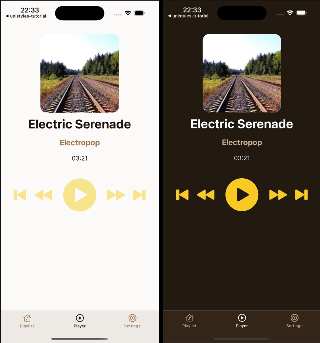
Perfect! You now have a complete music player interface that demonstrates many of Unistyles’ capabilities. Users can browse a playlist of songs, tap to navigate to individual tracks, and see a detailed player interface with media controls. The app maintains consistent theming throughout and handles navigation gracefully.
The hardcoded “banana” accent colors in both the `Button` and `PlayerControls` components are intentional placeholders. In the final part of our tutorial, we’ll connect these to the user’s accent preferences from the settings screen, making the entire app truly dynamic and personalized.
[ Previous](/v3/tutorial/modals)
[Part 6: Modals](/v3/tutorial/modals)
[Next ](/v3/tutorial/cross-platform)
[Part 8: Cross-platform](/v3/tutorial/cross-platform)
# Part 5: Settings screen
> Learn how to build a cross-platform app from scratch with Unistyles 3.0, Expo, and Reanimated
Time to bring our settings screen to life! We’ll create a beautiful settings interface that showcases how Unistyles integrates seamlessly with React Native’s `Pressable` component and explore the difference between `UnistylesRuntime` and the `rt` object.
Our settings screen will feature interactive tiles that users can tap to modify the app’s appearance.
### Create the SettingTile Component
[Section titled “Create the SettingTile Component”](#create-the-settingtile-component)
Let’s start by creating a reusable `SettingTile` component. This component will demonstrate one of Unistyles’ coolest features: zero-config integration with `Pressable` and `PressableStateCallbackType`.
Create a new file `components/SettingTile.tsx`:
components/SettingTile.tsx
```tsx
import { Pressable, PressableStateCallbackType, View } from 'react-native'
import { StyleSheet } from 'react-native-unistyles'
import { ThemedText } from './ThemedText'
type SettingTileProps = {
settingName: string,
selectedValue: string,
description: string,
onPress(): void
}
export const SettingTile: React.FunctionComponent = ({
settingName,
selectedValue,
description,
onPress
}) => {
return (
{settingName}
{description}
{selectedValue}
)
}
const styles = StyleSheet.create({
container: (state: PressableStateCallbackType) => ({
flexDirection: 'row',
alignItems: 'center',
justifyContent: 'space-between',
opacity: state.pressed ? 0.75 : 1,
})
})
```
This is where Unistyles really shines! Notice how we pass the `PressableStateCallbackType` directly to our style function. **No extra configuration needed** - Unistyles automatically recognizes that this style depends on the pressable state and handles all the complexity for you.
When you press the tile, the opacity changes from `1` to `0.75`, giving users immediate visual feedback.
### Enhance ThemedText with Variants
[Section titled “Enhance ThemedText with Variants”](#enhance-themedtext-with-variants)
You might have noticed we’re using `bold` and `dimmed` props on `ThemedText` that don’t exist yet. Let’s add them using Unistyles variants.
Update your `ThemedText` component:
components/ThemedText.tsx
```diff
import { Text, type TextProps } from 'react-native'
import { StyleSheet, type UnistylesVariants } from 'react-native-unistyles'
export type ThemedTextProps = TextProps & UnistylesVariants
export function ThemedText({
style,
type,
+bold,
+dimmed,
...rest
}: ThemedTextProps) {
styles.useVariants({
type,
+ bold,
+ dimmed
})
return (
+
- Settings
+ Appearance
+
+ {}}
+ />
+ {}}
+ />
+
);
}
+ const styles = StyleSheet.create((theme, rt) => ({
+ scrollView: {
+ marginTop: rt.insets.top + theme.gap(3),
+ backgroundColor: theme.colors.background,
+ paddingHorizontal: theme.gap(2)
+ },
+ settingsContainer: {
+ marginTop: theme.gap(4),
+ gap: theme.gap(4)
+ },
+}));
- const styles = StyleSheet.create((theme, rt) => ({
- container: {
- flex: 1,
- marginTop: rt.insets.top,
- paddingHorizontal: theme.gap(2)
- },
-}));
```
### UnistylesRuntime vs rt Object
[Section titled “UnistylesRuntime vs rt Object”](#unistylesruntime-vs-rt-object)
Here’s where things get interesting. Notice we’re using `UnistylesRuntime.hasAdaptiveThemes` instead of accessing it through `rt`.
**What’s the difference?**
* **`rt` (mini runtime)**: is only available inside `StyleSheet.create()` function or `useUnistyles` hook. It contains device metadata like insets, screen dimensions, and color scheme that are relevant for styling
* **`UnistylesRuntime`**: A global object accessible **anywhere** in your app, not just in stylesheets or components. It contains all the same information as `rt` plus additional methods (setters)
The key difference is that `UnistylesRuntime` is **not a hook** - it won’t cause your component to re-render when values change. This is by design for performance reasons.
If you need your component to re-render when runtime values change, you should use the `useUnistyles` hook instead:
```tsx
// This will not re-render when runtime changes
const isSystemTheme = UnistylesRuntime.hasAdaptiveThemes
// This will re-render when runtime changes
const { rt } = useUnistyles()
```
Note
Learn more about `UnistylesRuntime` in the [dedicated guide](/v3/references/unistyles-runtime).
### ScrollView Background Issue
[Section titled “ScrollView Background Issue”](#scrollview-background-issue)
Try switching between light and dark themes in your app. You’ll notice something odd - the `ScrollView` background color doesn’t update! This is because `contentContainerStyle` is not a regular style prop that Unistyles can automatically track.
For such cases we created `withUnistyles` higher-order component (HOC) that allows you to wrap any component and automatically re-render it, depending on it’s dependencies.
Note
For views that either don’t use the `style` prop or aren’t React Native components, you can use the `withUnistyles` HOC. Check out the [withUnistyles guide](/v3/references/with-unistyles) for more details on when and how to use it.
In order to update background color of `ScrollView`, we need to wrap it with `withUnistyles`:
app/settings/index.tsx
```diff
import { SettingTile } from '@/components/SettingTile'
import { ThemedText } from '@/components/ThemedText'
import { ScrollView, View } from 'react-native'
-import { StyleSheet, UnistylesRuntime } from 'react-native-unistyles'
+import { StyleSheet, UnistylesRuntime, withUnistyles } from 'react-native-unistyles'
+const StyledScrollView = withUnistyles(ScrollView)
export default function SettingsScreen() {
const systemTheme = UnistylesRuntime.hasAdaptiveThemes
return (
-
+
Appearance
{}}
/>
{}}
/>
-
+
);
}
const styles = StyleSheet.create((theme, rt) => ({
scrollView: {
marginTop: rt.insets.top + theme.gap(3),
backgroundColor: theme.colors.background,
paddingHorizontal: theme.gap(2)
},
settingsContainer: {
marginTop: theme.gap(4),
gap: theme.gap(4)
},
}));
```
That’s it! No additional mappings are required in `withUnistyles` as `contentContainerStyle` is handled automatically.
Remember these key points about `withUnistyles`:
* It intelligently re-renders your component only when its style dependencies change, optimizing performance
* It accepts a mapping function as a second argument, allowing you to map `theme` or `rt` values to the component’s props
### Add Modal Navigation
[Section titled “Add Modal Navigation”](#add-modal-navigation)
Finally, let’s wire up the `onPress` callbacks to navigate to our modal screens:
app/settings/index.tsx
```diff
import { SettingTile } from '@/components/SettingTile'
import { ThemedText } from '@/components/ThemedText'
import { ScrollView, View } from 'react-native'
import { StyleSheet, UnistylesRuntime } from 'react-native-unistyles'
+import { router } from 'expo-router'
const StyledScrollView = withUnistyles(ScrollView)
export default function SettingsScreen() {
const systemTheme = UnistylesRuntime.hasAdaptiveThemes
return (
Appearance
{}}
+onPress={() => router.push('/(tabs)/settings/settings-theme')}
/>
{}}
+onPress={() => router.push('/(tabs)/settings/settings-accent')}
/>
);
}
```
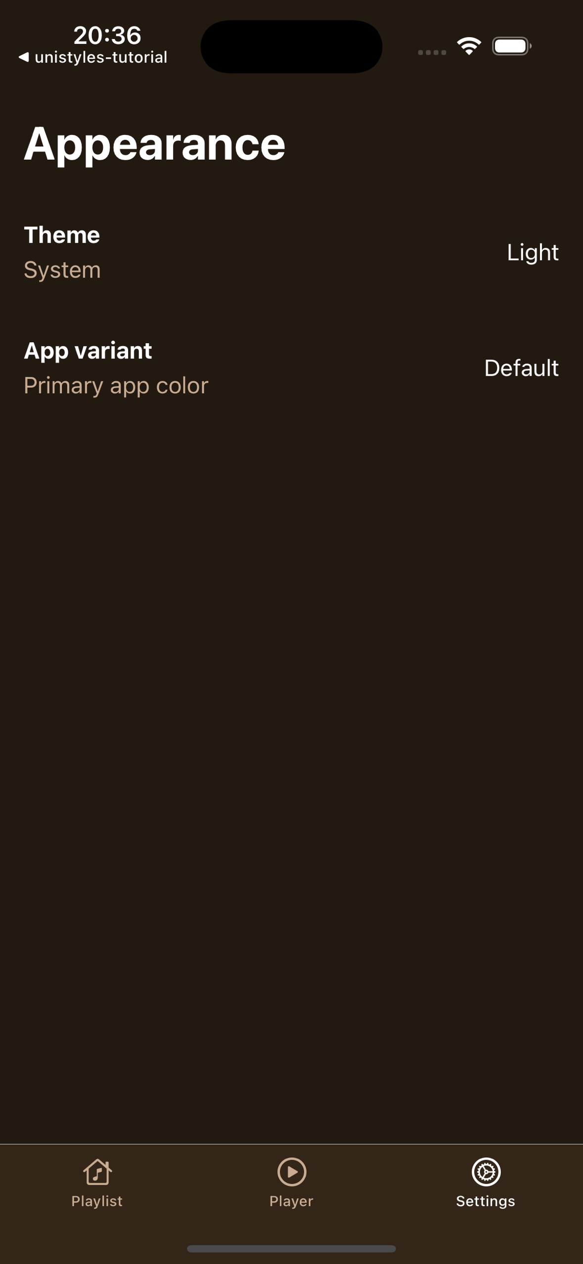
Perfect! Your settings screen now has interactive tiles that provide immediate visual feedback and navigate to the appropriate modal screens. In the next part, we’ll implement the functionality for these modals and show how to dynamically update themes and accent colors.
[ Previous](/v3/tutorial/new-screens)
[Part 4: New screens](/v3/tutorial/new-screens)
[Next ](/v3/tutorial/modals)
[Part 6: Modals](/v3/tutorial/modals)